TzStats blockchain explorer design
Discovering Tezos with TzStats Explorer
Tezos Foundation, the force behind the pioneering cryptocurrency Tezos, promotes decentralized decision-making.
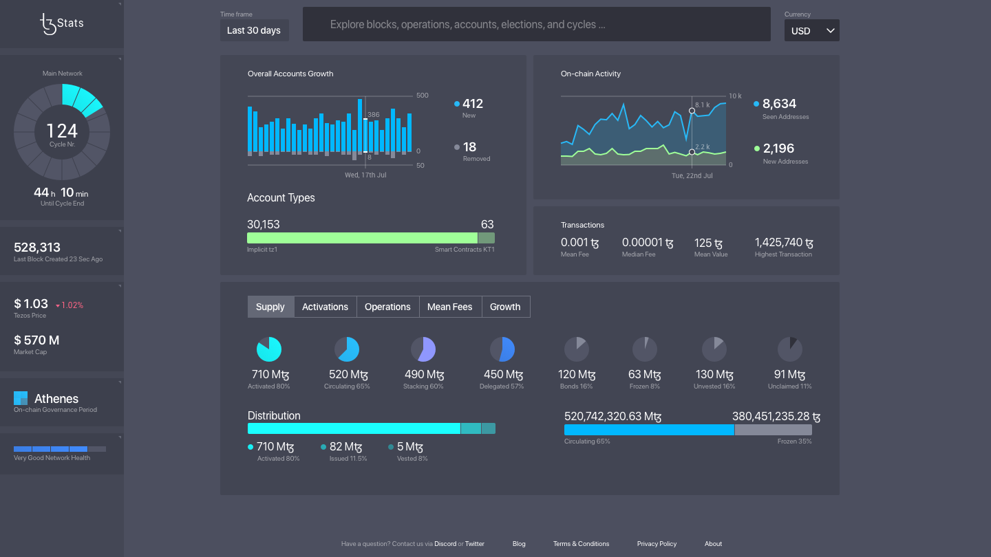
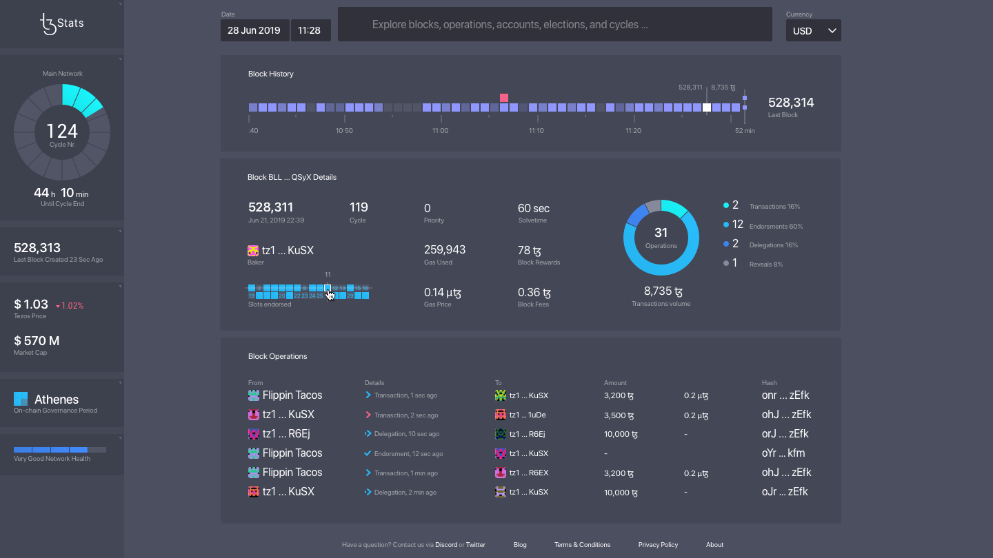
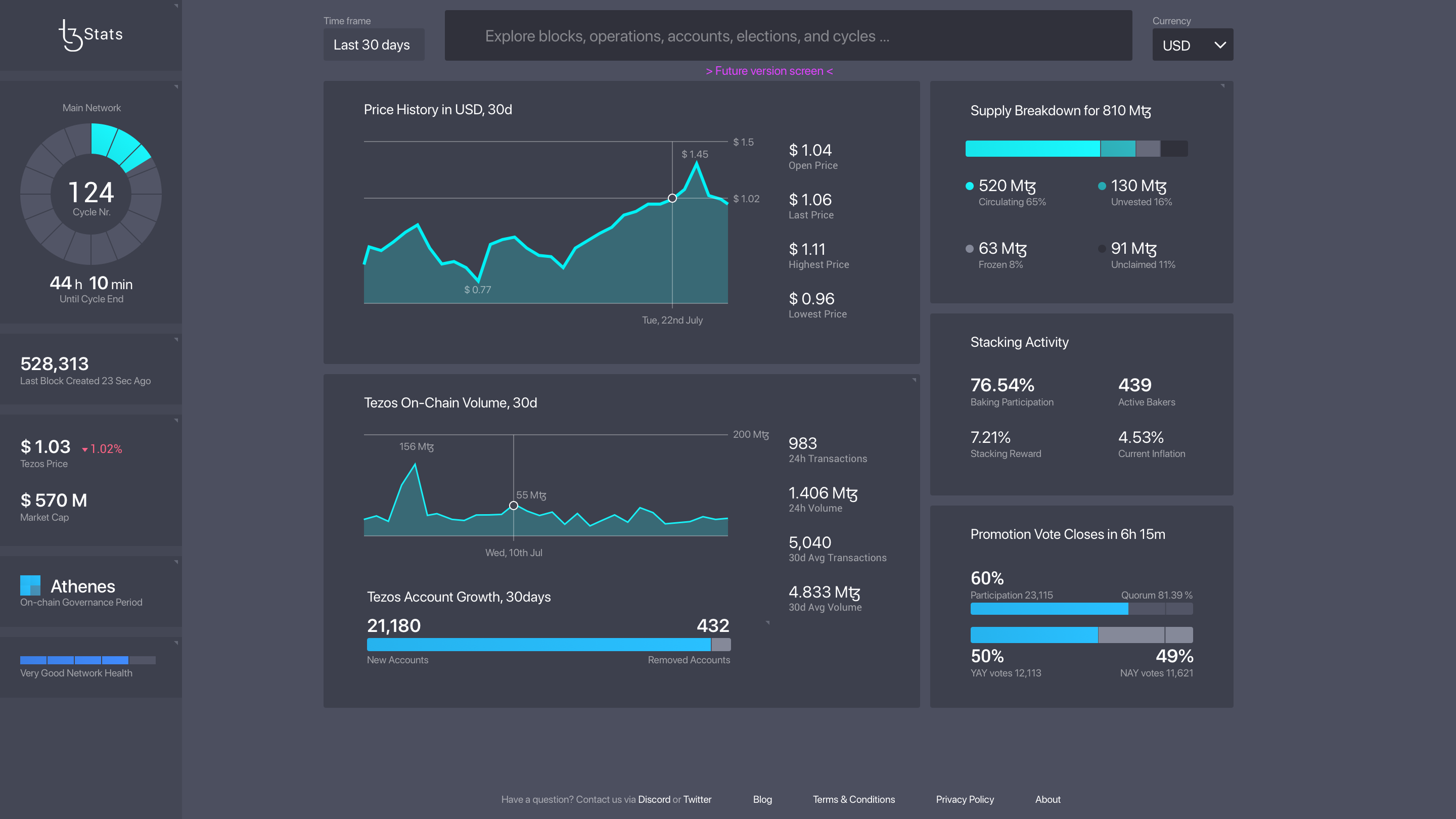
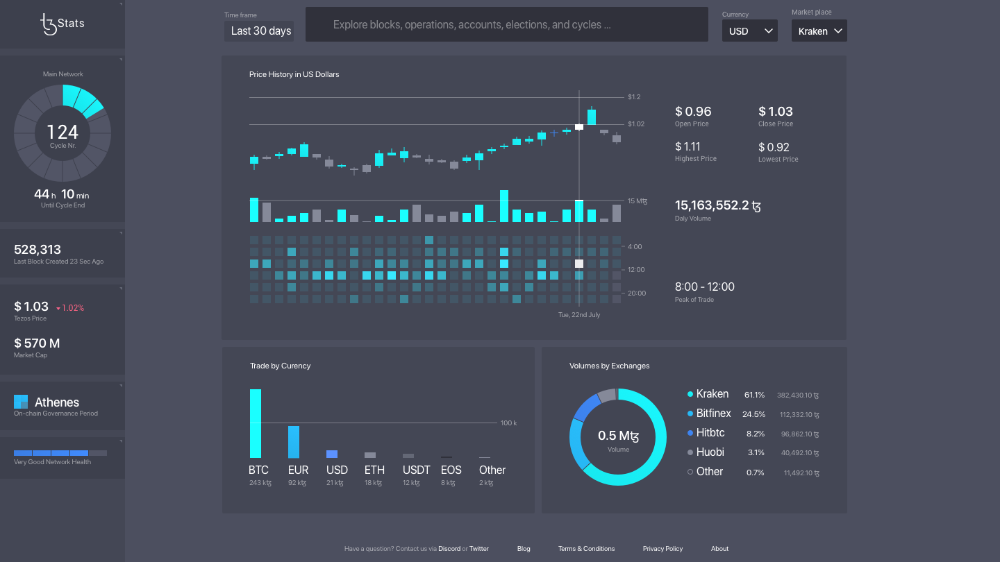
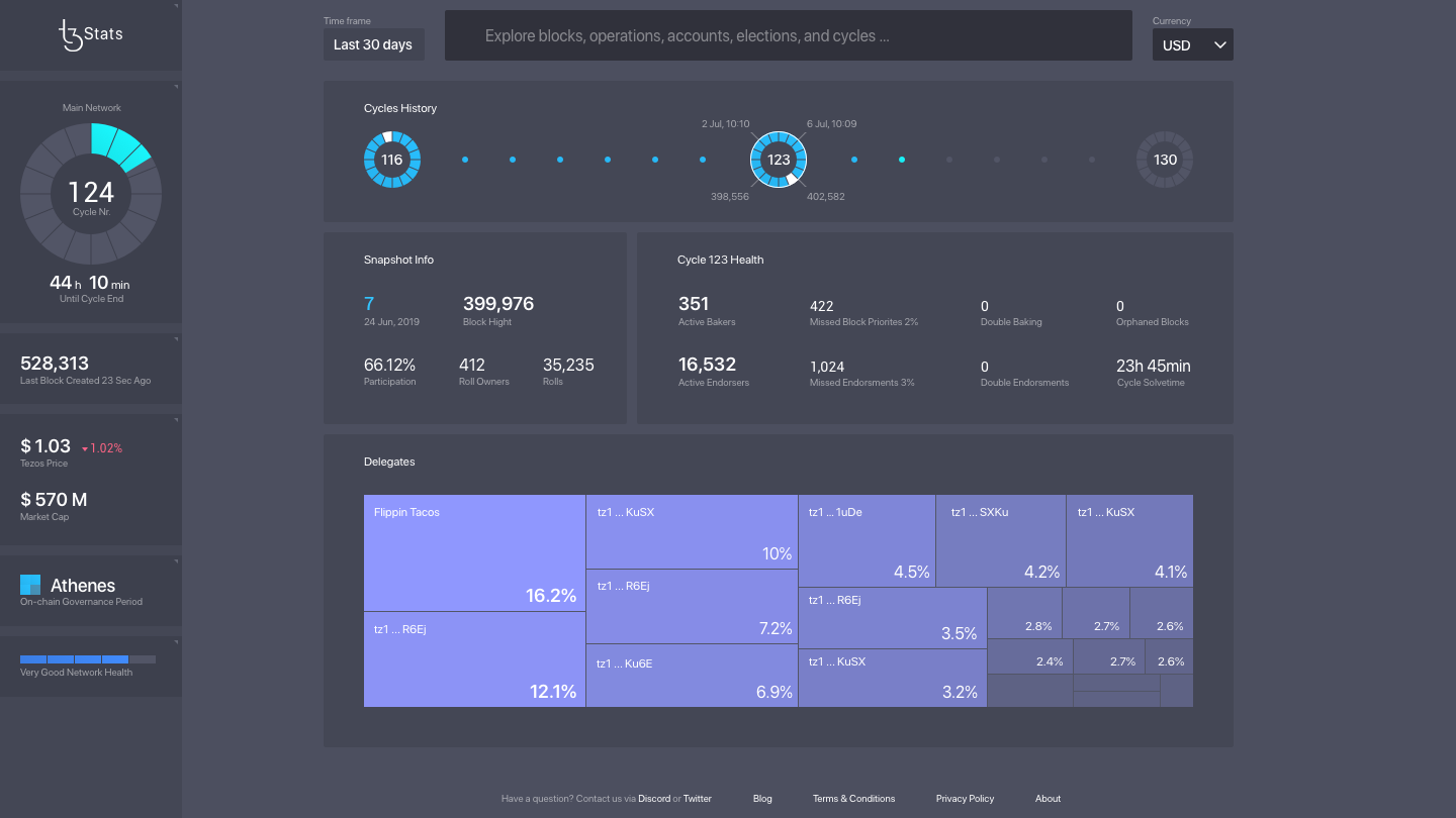
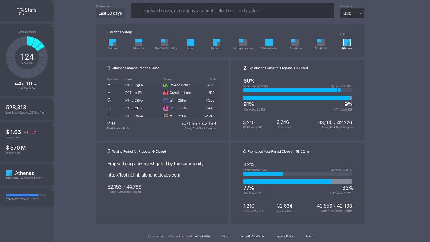
I designed a web interface for TzStats Explorer, a tool that enables users to analyze the health of the Tezos blockchain. My goal was to create a comprehensive web app to track the growth and health of the Tezos blockchain, showcasing complex data through clear infographics on a desktop interface.
The target audience for this project includes blockchain enthusiasts, business owners, and investors, and our user personas cater to varying levels of technical expertise. The result is a user-friendly interface that offers valuable insights into the Tezos ecosystem.
Design Strategy
- Our UX strategy centered on understanding user behavior and motivations, to create a tailored design.
- We prioritized a clear information architecture and user flow, allowing for smooth navigation throughout the explorer.
- By exploring eight types of user profiles, we identified key requrements to focus on.
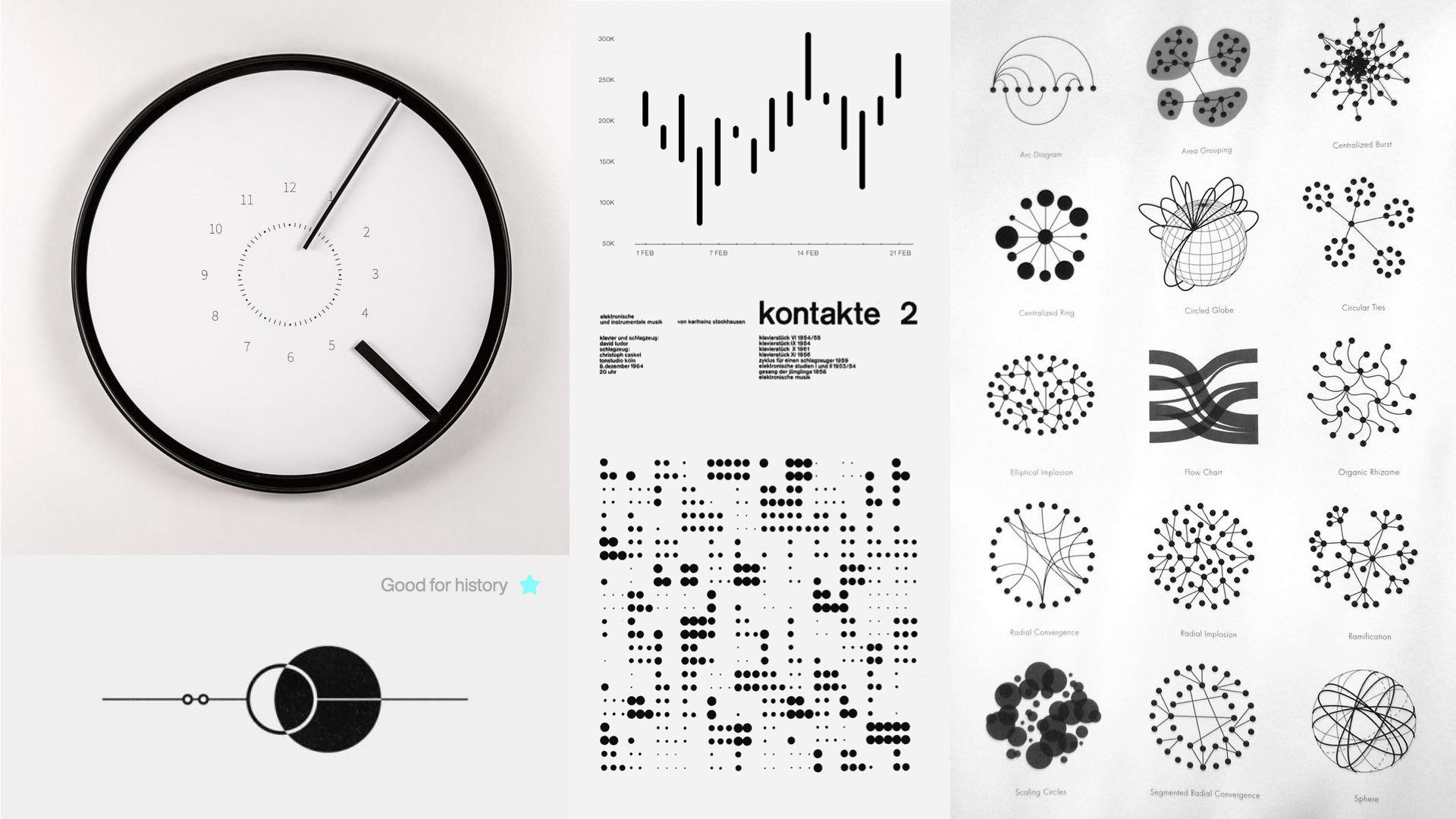
- We collected inspirations and references to establish a visual direction for the Tezos explorer.
- The final result is a consistent visual language that conveys the essence of blockchain technology.
Research & Discovery
Out of all the potential user profiles we researched: Infrastructure Operator, Blockchain Developer, Foundation Manager, Journalist, Influencer, Creative Adopter, Fund Manager, Researcher, Data Scientist, and Trader our focus become the Fund Manager. These individuals have a strong interest in growing the ecosystem, generating interest, and guarding their interests while maintaining a clear understanding of the market dynamics.
By catering to the Fund Manager user profile, we aimed to create an intuitive and informative experience on the Tezos browser that meets their specific needs and goals.

Prototyping
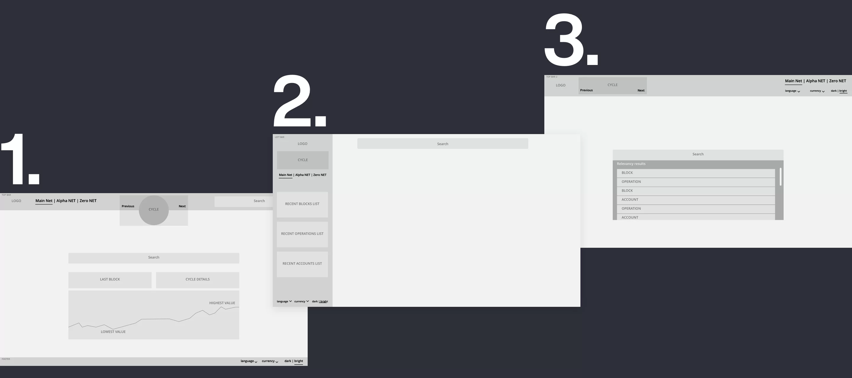
In the prototyping phase, we explored three design variations to optimize the user experience.
- The first design featured a top bar and footer, presenting the most relevant statistics on the landing page.
- The second option included a left navigation bar, resembling the structure of a system or web application.
- The third variation was a minimalistic approach, showcasing a top bar and search functionality on the home page only, inspired by Google's search layout.
These iterations allowed us to evaluate different visual and functional layouts to determine the most effective solution for our users.
Visual Design
Exploring the aesthetics, semantics, and information design for TZ Stats
Digital symbolism of crypto age
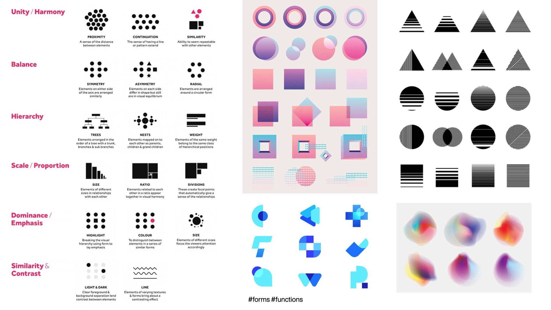
We looked into various representations and symbolics of the digital age and blockchain specifically. Through the conceptualization cycle, we explore aesthetics, semantics, and language used to present crypto technologies.
In the mood board collection, placed inspirational visuals elements that trigger a further exploration of the theme. Additionally, we looked into the various graphical elements, graphs, and charts to cover the part directly related to the explorer properties. Since TzStats aimed to present different information bits in a concise, easy-to-digest manner, we looked into direction analytics and infographics.
Color scheme & elements design
Defining the blockchain aesthetics with calculated color coding
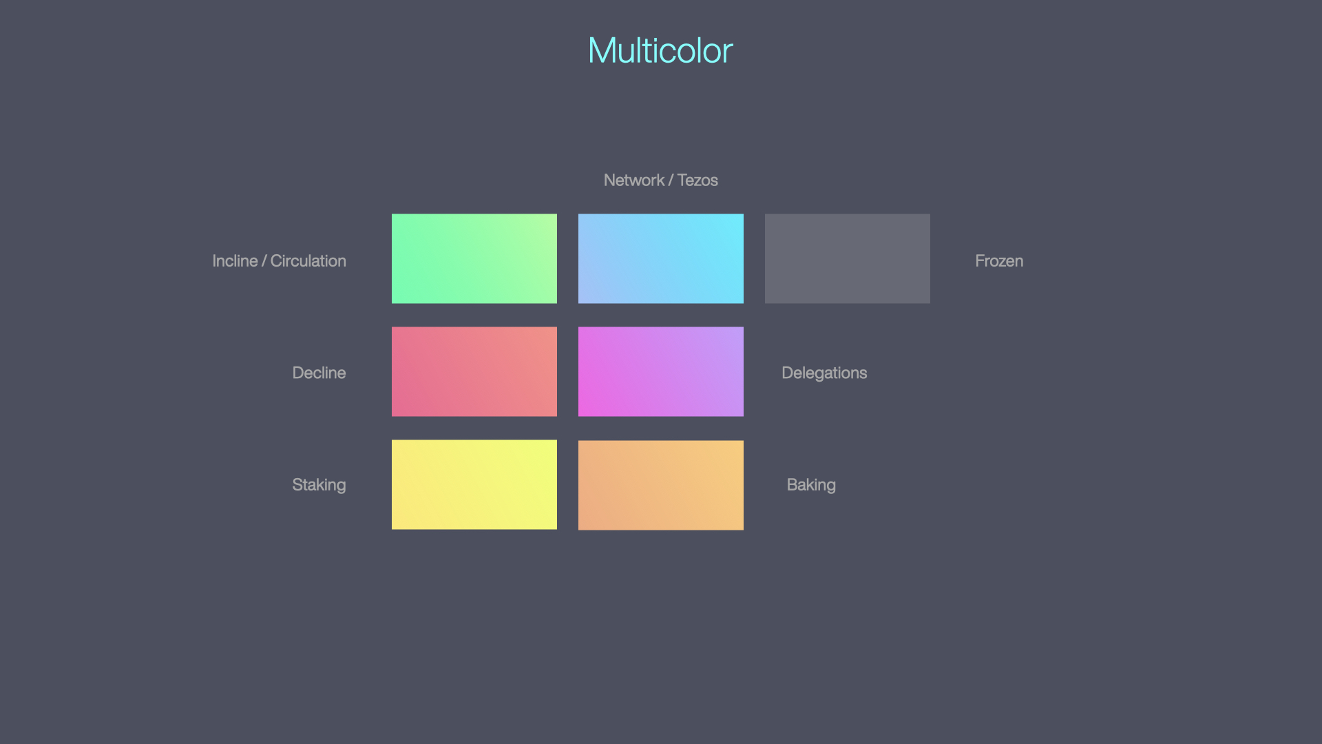
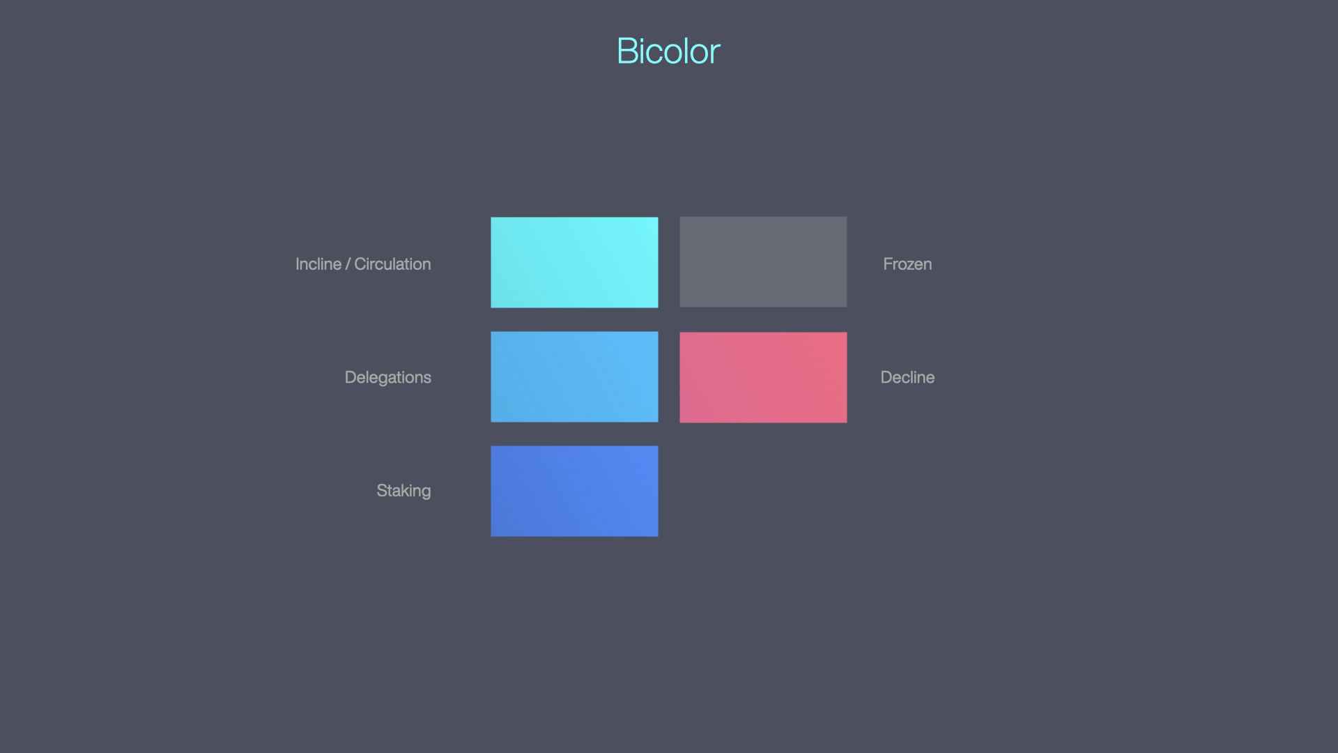
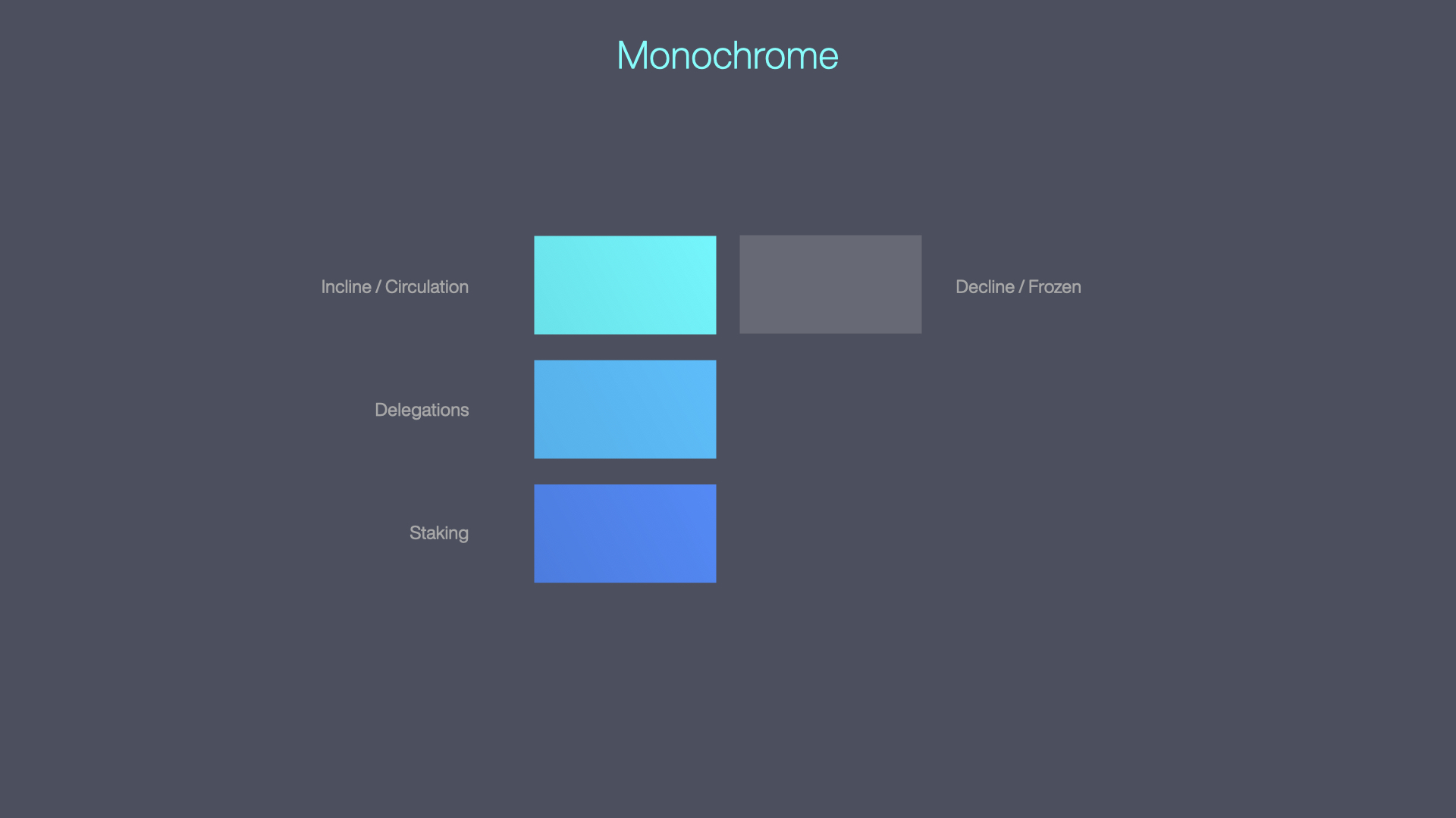
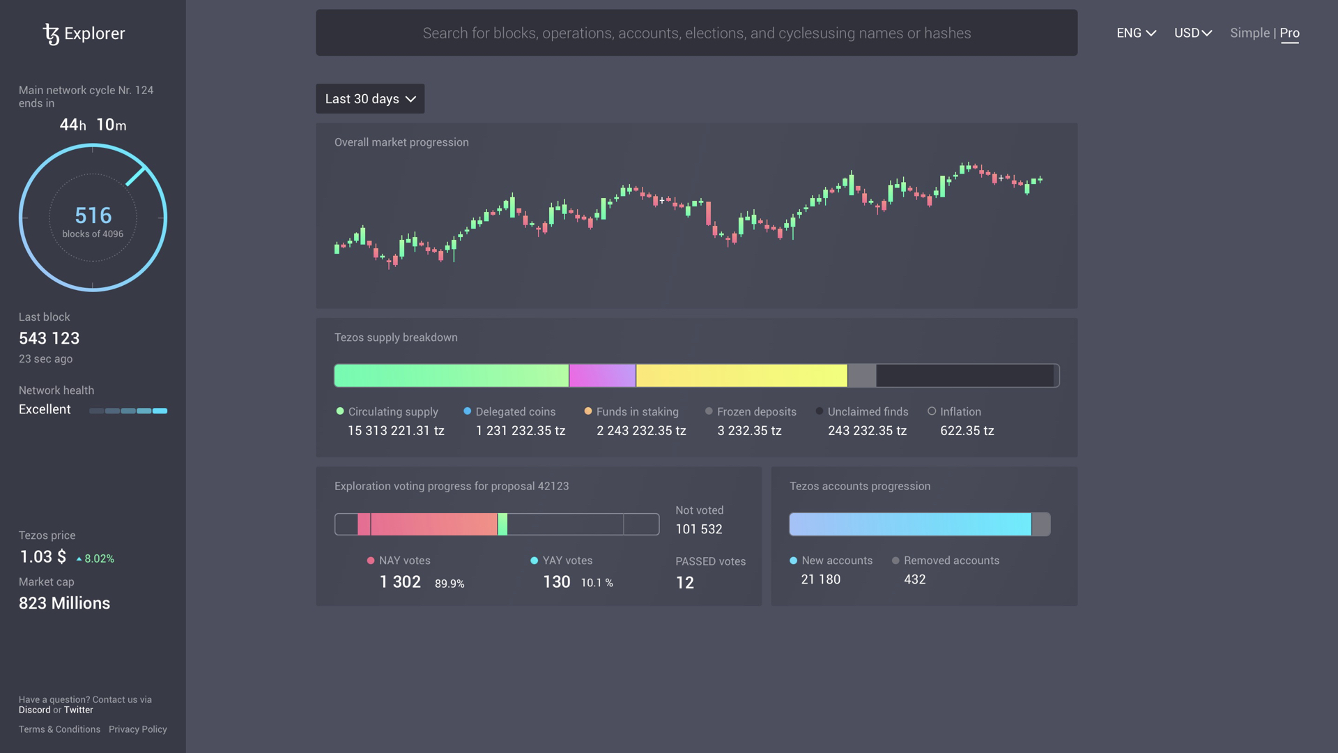
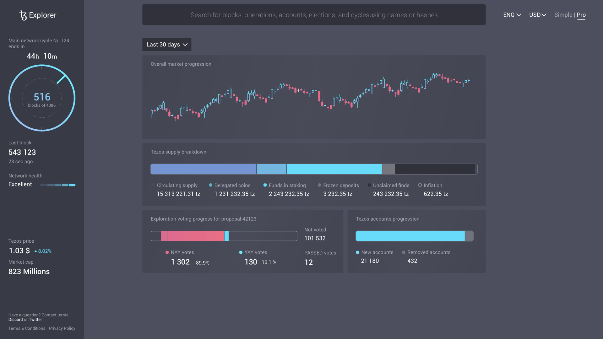
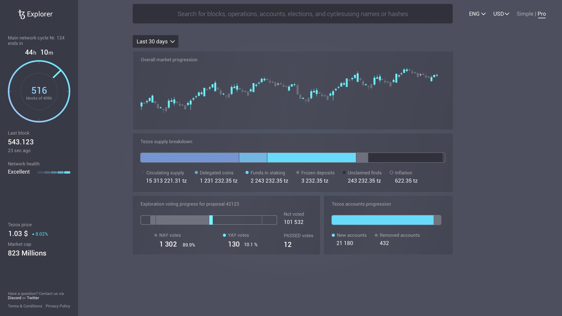
During our research, we pinpointed the need for a serious and structured design due to low trust in blockchain technology. Classical candle charts served as our interface foundation, influencing sections, graphs, symbols, and iconography. Color played a vital role, with a color-coding system implemented for various states and statuses.
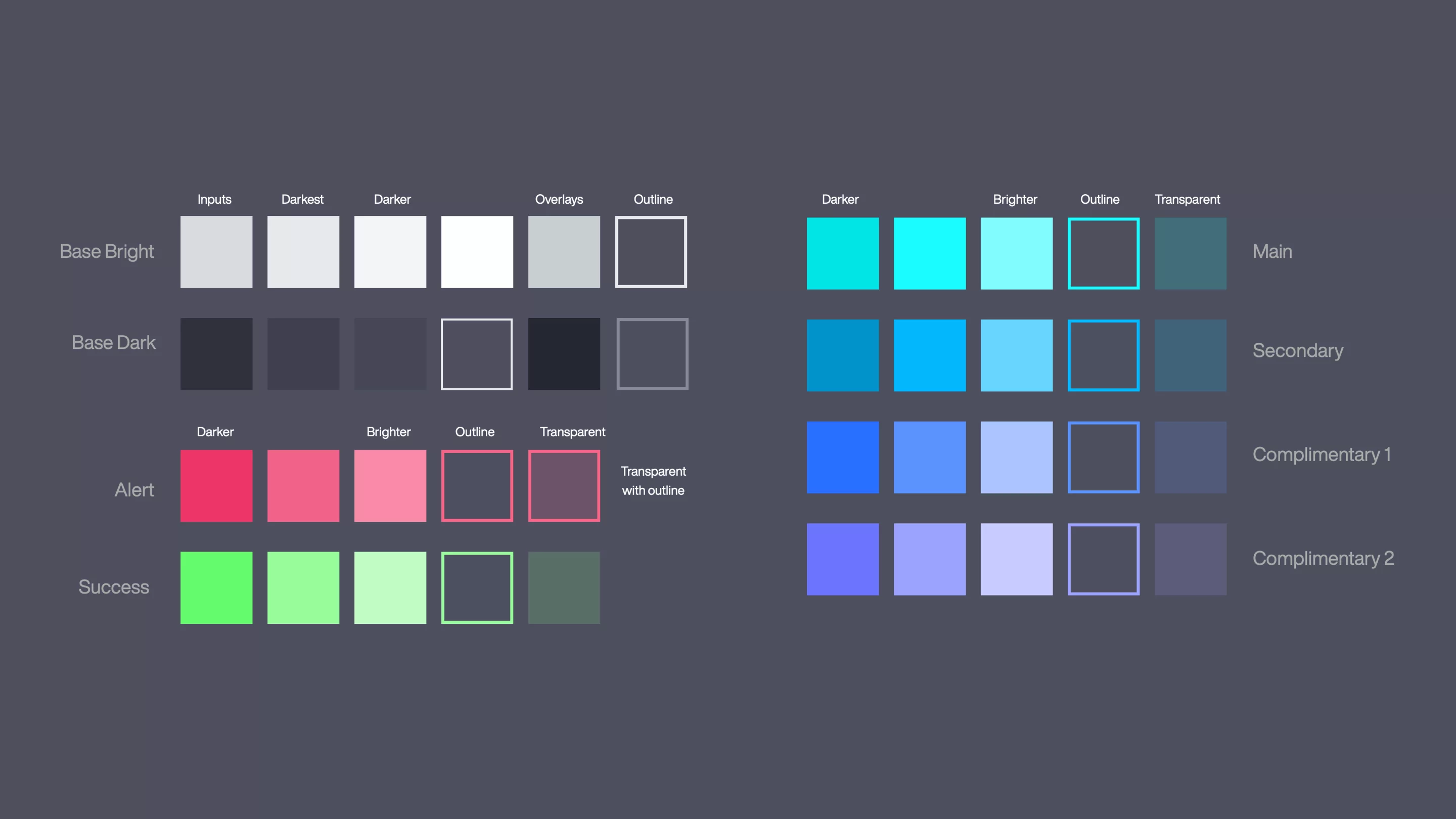
Working with the TzStats team, we chose a dark theme featuring eye-catching colors and explored three color schemes: multicolor gradient, bicolor flat, and monochrome cold flat. The monochrome scheme was preferred, leading us to expand primary colors to main, secondary, and two complimentary shades.
User Testing
Final design
The final design is where everything comes together. Research and exploration serve as a starting point. Later, transitioning to the ideation and conceptualization step. At the phase of wireframing and prototyping, all abstractions and definitions coming to the real digital product.
Nowadays, TzStats explorer stands for a comprehensive tool used by thousands of people in the Tezos community and beyond. TzStats is the crucial source of data that Coinmarketcap, Coinbase, and others are referencing to. Tezos is at the heart of the digital revolution.
Check out a couple of screen renders of the final result.
Alexander Eichhorn
Mirko Schmiedl
Andrei Vaulin
Oliver Simon
