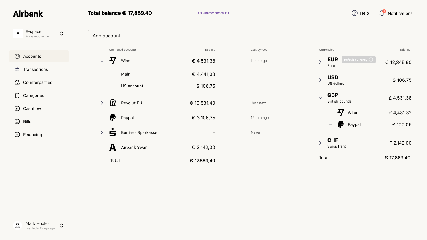
Airbank business banking webapp
Redefining business banking for next-gen finance management
Few steps of the transformational journey of Airbank (now Friday Finance), a dynamic fintech company. Our goal was to redefine banking for businesses, providing comprehensive financial overviews and empowering cash flow management.
Targeting businesses of all sizes, Airbank offers refined solutions for seamless financial management. I aimed to simplify banking tasks, enhance financial well-being, and build trust with the intuitive platform.
Design Strategy
- In our design process, we migrated from Adobe XD to Figma for prototyping due to its enhanced functionality.
- To ensure a single source of truth, we maintain an Notion page that serves as a comprehensive collection of links and resources for easy access and reference.
- User-centric approach with focus on empathy, deepening relationships and ensuring data security and privacy.
- Streamlined financial management for cognitive and emotional problem-solving, driven by continuous user feedback and iterative design.
- Seamless integration with multiple accounts and platforms, delivering superior products in the market.
Research & Discovery
Through ongoing one-on-one sessions, our dedicated user researcher diligently conducted research and discovery to uncover potential issues. These sessions served as a valuable platform for gathering valuable insights and feedback from users, enabling us to identify and address key pain points effectively.
Prototyping
Visual Design
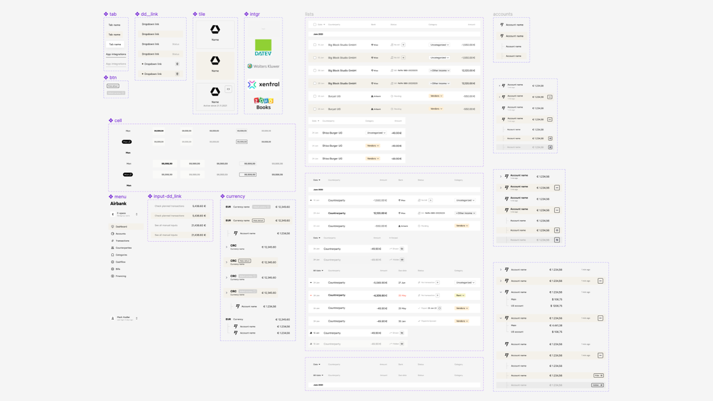
Color scheme & elements design
Revamped color scheme for improved accessibility
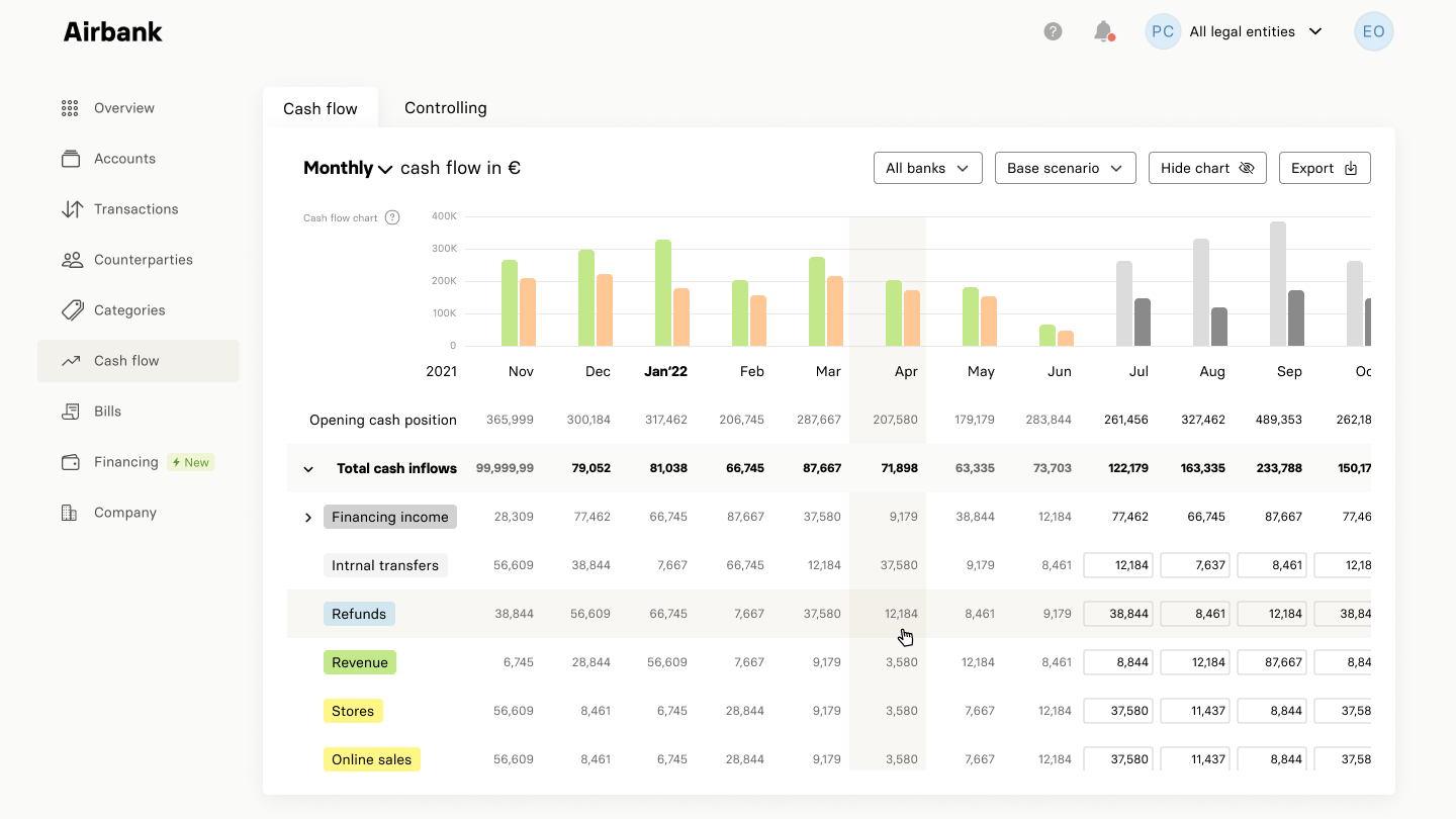
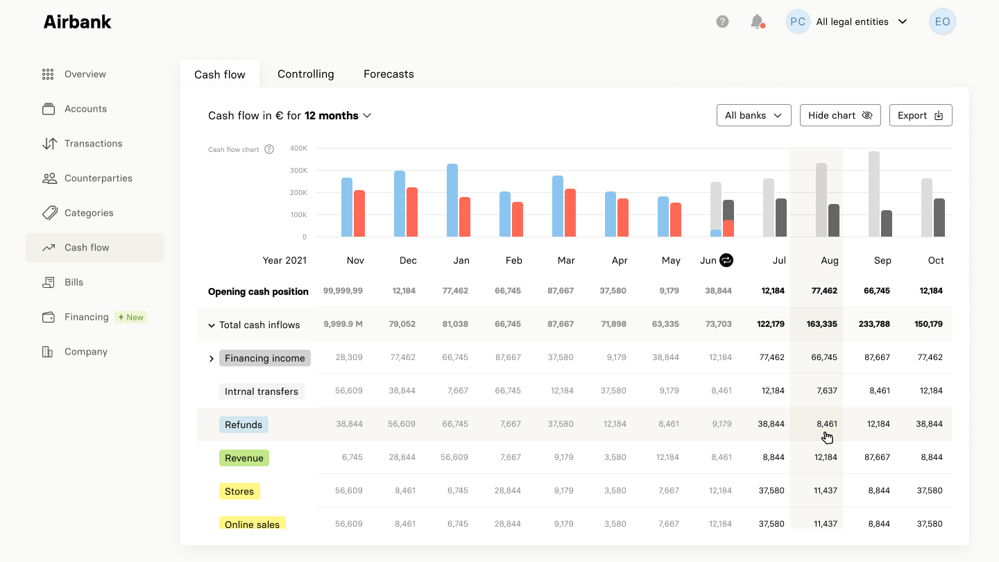
In Airbank's visual design, color differentiation for colorblind users was problematic. The original green and orange colors were difficult to distinguish. To improve accessibility, blue and red were proposed as new colors. This enhances visibility and ensures an inclusive user experience.
User Testing
Final design
Adapting to dynamic shifts
Due to changes in project requirements and rebranding, the overall design envisioned for the project was not implemented. While the initial design showcased promising elements, the evolving nature of the project necessitated adjustments to align with the new direction.
Friday Finance - former Airbank
