Humanitec DevOps web application
Transforming Humanitec's internal developer platform
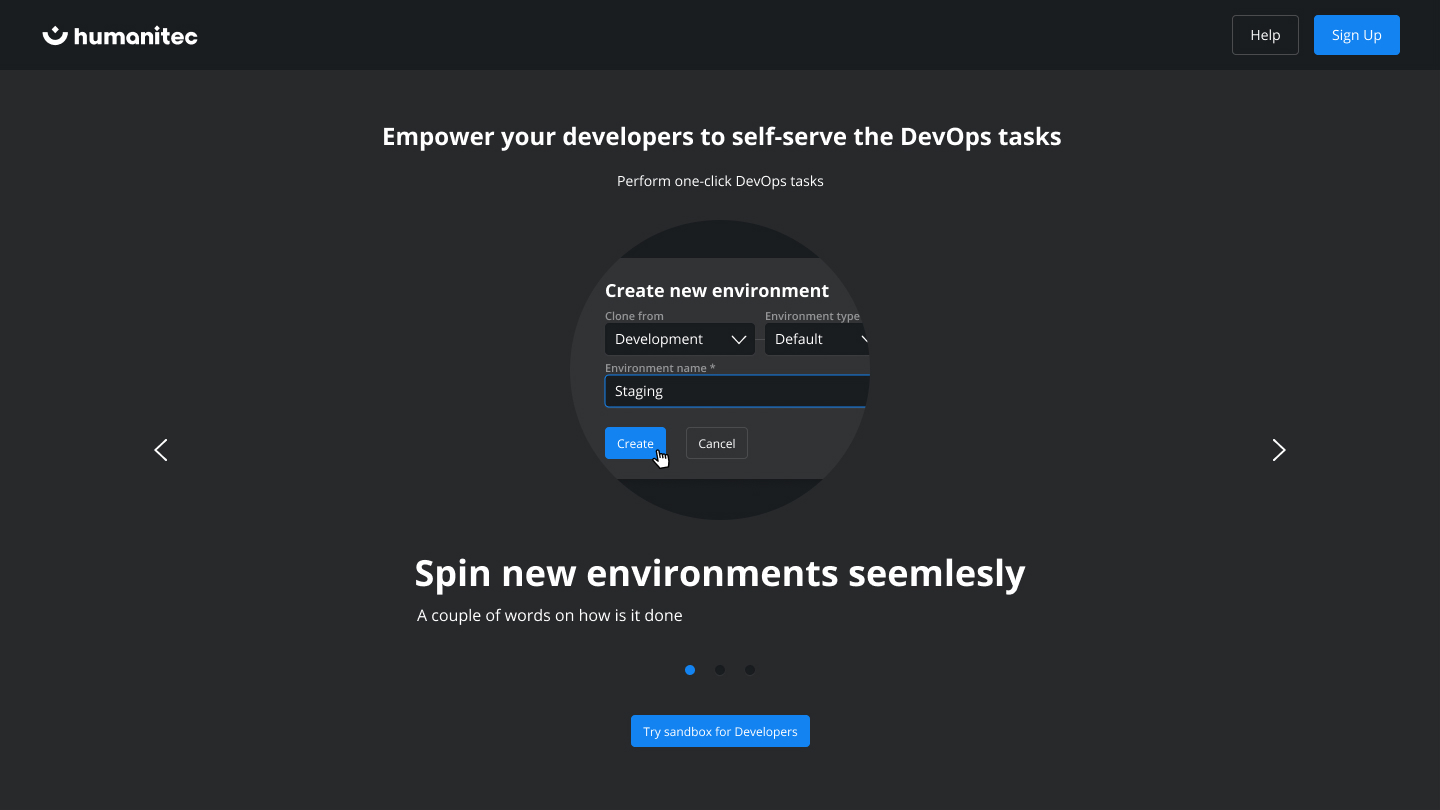
Humanitec is the creator of an innovative tool, the Internal Developer Platform. This platform is designed to expedite the deployment of applications to Kubernetes, while also providing the ability to establish multiple environments, simplifying developers' tasks and amplifying their autonomy and efficiency.
My project's primary focus is to evolve this remarkable tool from its current stage to a more sophisticated, dynamic phase. I aimed to enhance its usability, boost its visual appeal, and standardize the user experience by identifying common usage patterns and creating reusable interface solutions. The ultimate goal is to ensure a functional, aesthetically pleasing, and user-friendly design that simplifies the complexities of DevOps.
The platform caters primarily to developers and engineering teams who are overwhelmed with managing numerous scripts in DevOps. Our solution automates these tedious processes, liberating users from the 'script hell' and allowing them to concentrate on more engaging tasks. We envision this platform as an invaluable tool, designed to promote efficiency and make their work more enjoyable.
Design Strategy
- We defined design principles of simplicity, clarity, and consistency for a seamless user experience in parallel with the brand vision.
- Our UX strategy focuses on understanding user needs through continuous user interviews led by a dedicated researcher.
- Information architecture focused on the abstraction of Kubernetes and introducing a simplified uncommon navigational layout.
- User flow is regularly revised based on user feedback in accordance with the complex engineering tasks for a smooth, efficient journey.
- Regular UX updates sessions include project managers, front-end developers, user researchers, and QA to ensure an optimal UX design cycle.
Research & Discovery
In today's digital landscape, developer tools like Humanitec are making waves. Aimed at innovative teams that are too large for a Platform as a Service (PaaS) but too small to sustain a dedicated platform team, tools like these are filling a critical gap. They're creating a new niche in the DevOps landscape where agility, autonomy, and efficiency are highly valued.
While several DedvOps tools exist in the market, Humanitec stands out with its open API and developer-focused interface. Its unique selling proposition lies in its ability to master Continuous Delivery for Kubernetes-ready applications. It's crucial to understand and build upon these strengths to stay ahead of the competition.
Our user research has revealed a target audience of engineers seeking to streamline their workflow. The typical user persona is an innovative developer looking to increase development velocity by accessing necessary tech autonomously. Understanding this persona drives our design decisions and allows us to create a platform that genuinely meets user needs.
Prototyping
Visual Design
Unfolding the journey from simple prototypes to a robust system interface with Humanitec's design evolution
Linear dynamics transformation
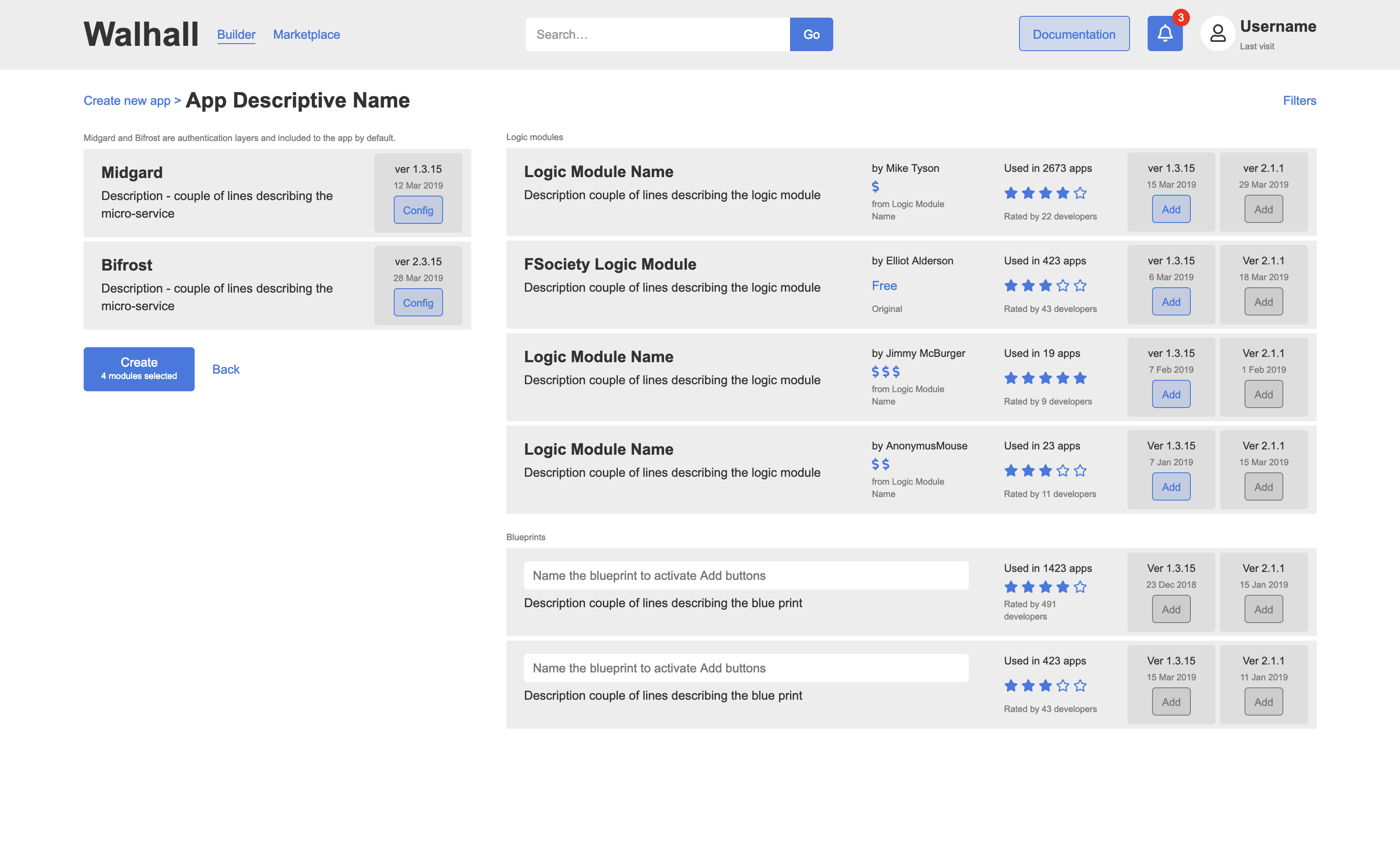
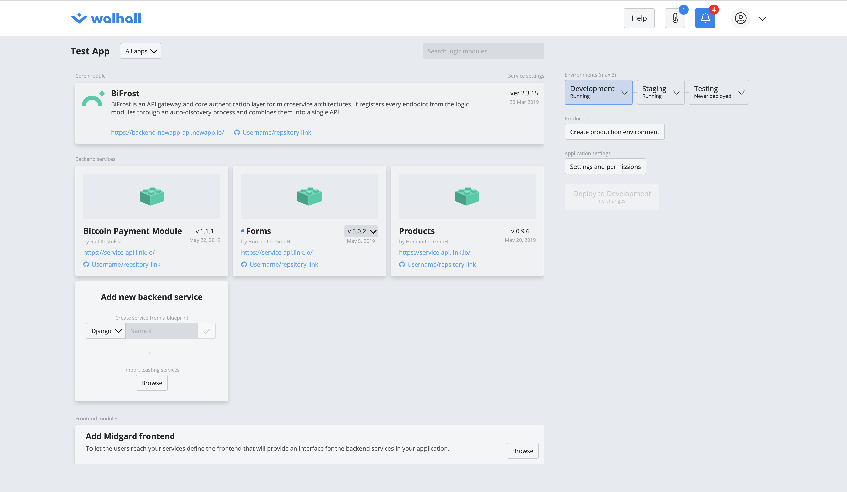
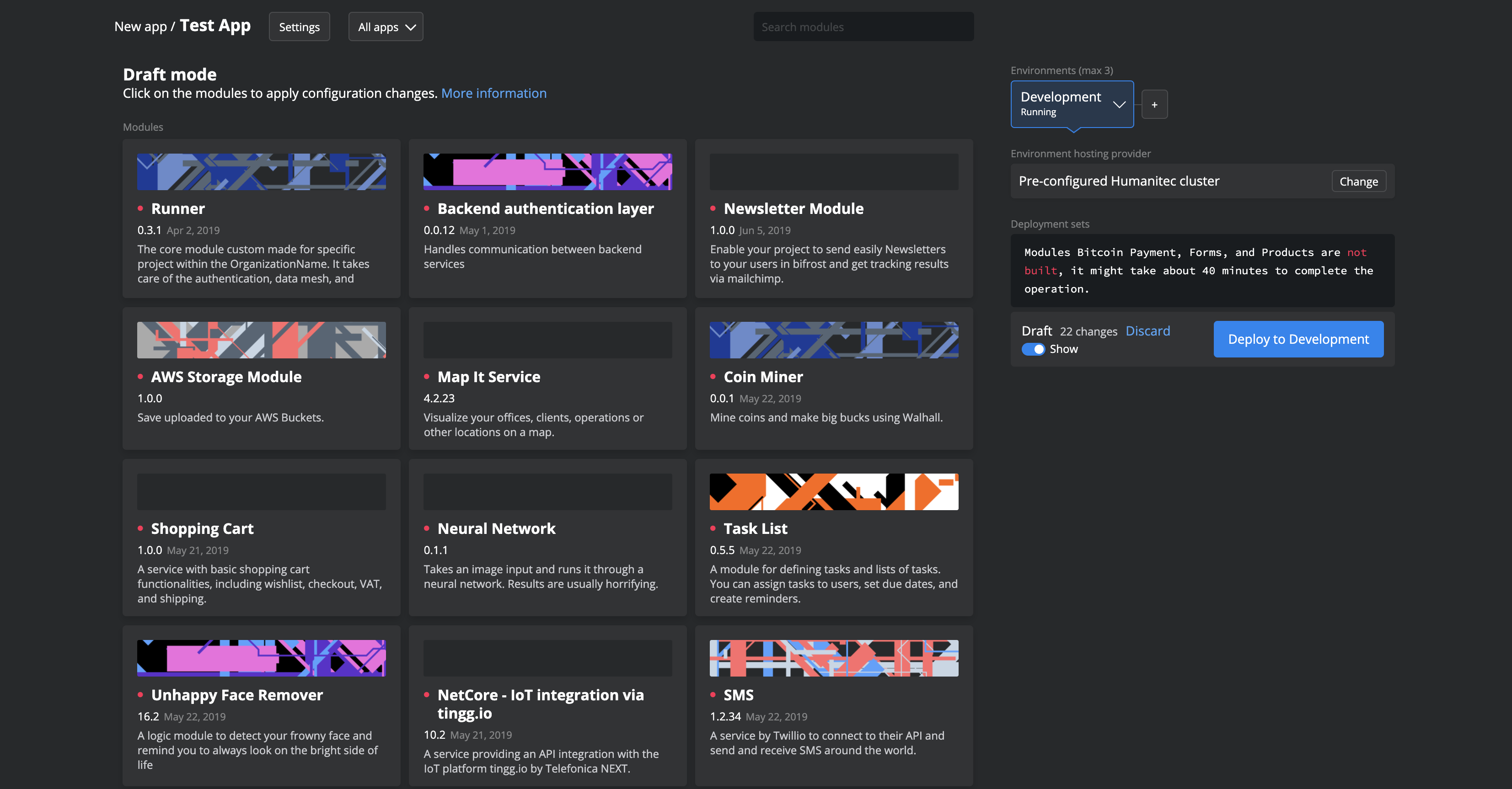
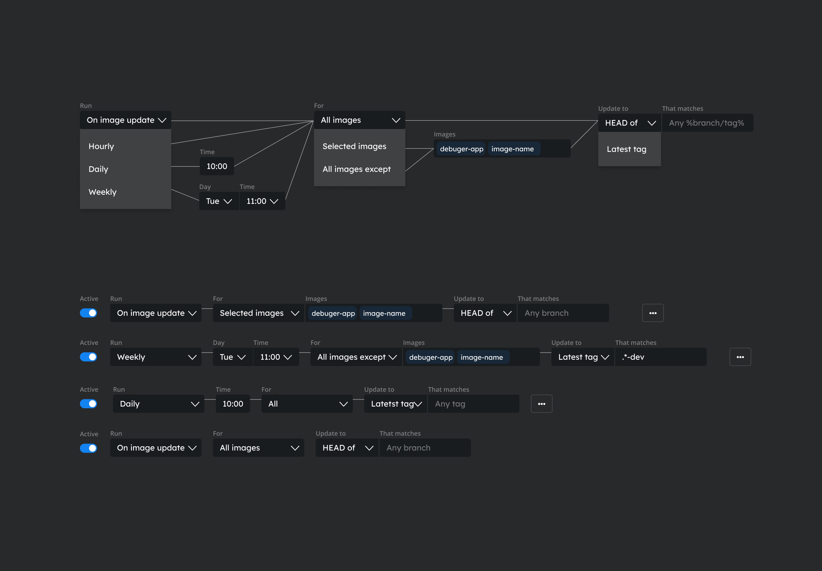
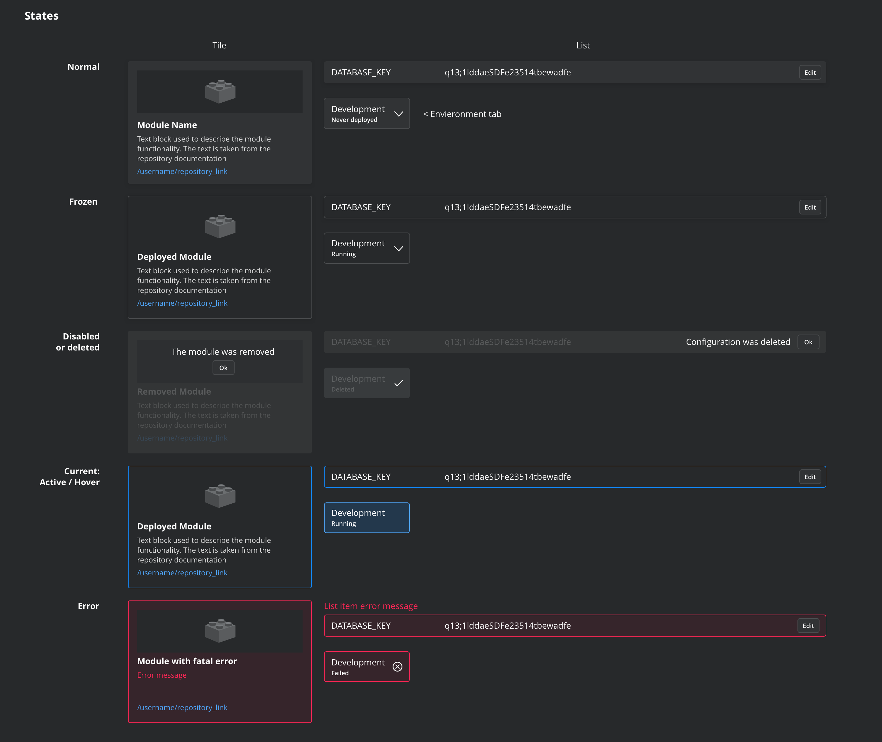
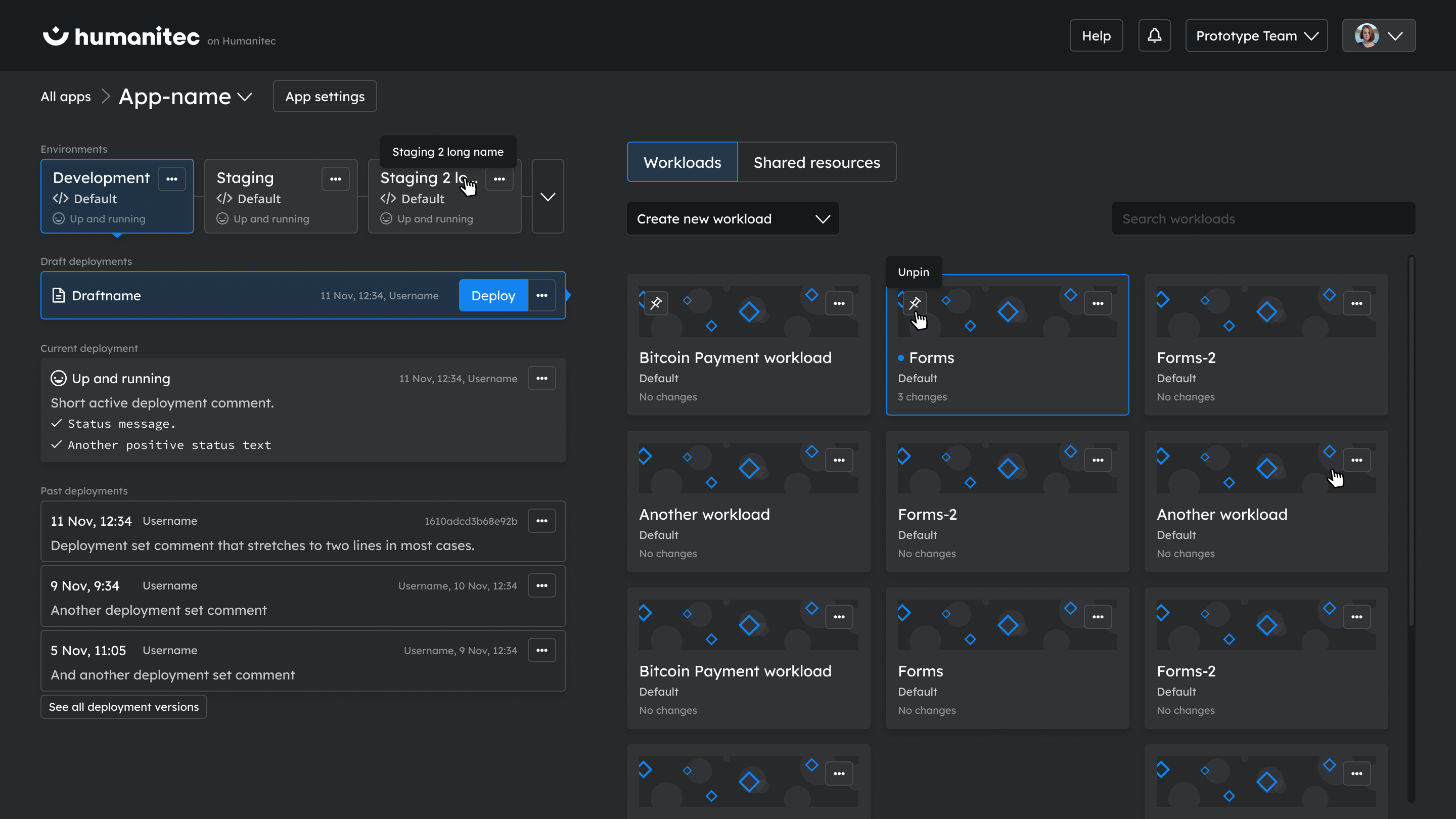
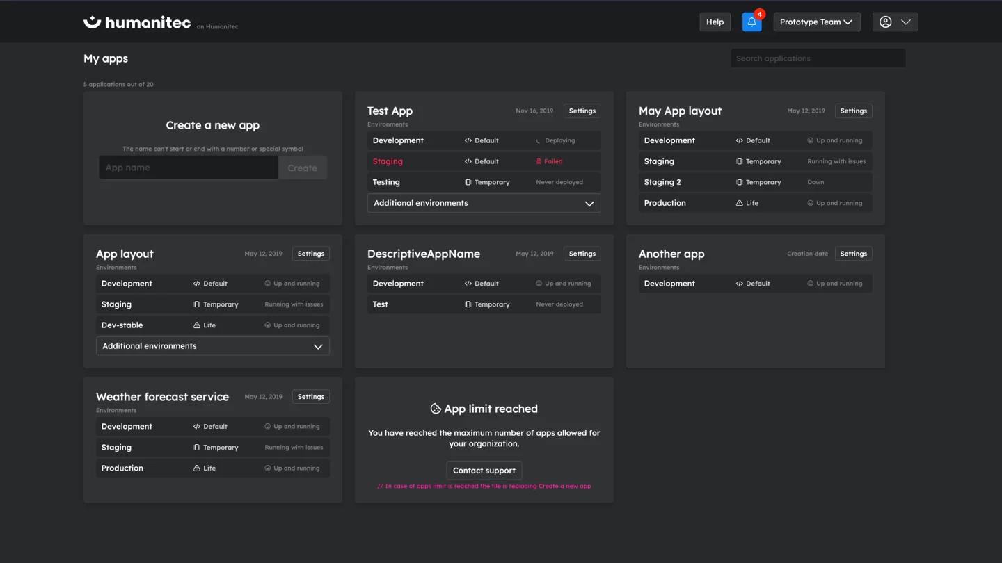
In the early stages of our design process, we utilized list items to structure the workflow. This approach provided a straightforward, linear view of the tasks. However, as we continued to refine and optimize, we transitioned from list items to a tile-based design.
This shift not only added a visual appeal to the interface but also allowed for a more flexible, dynamic workflow representation, enhancing user interaction and ease of use.
Aesthetics and usability rebalancing
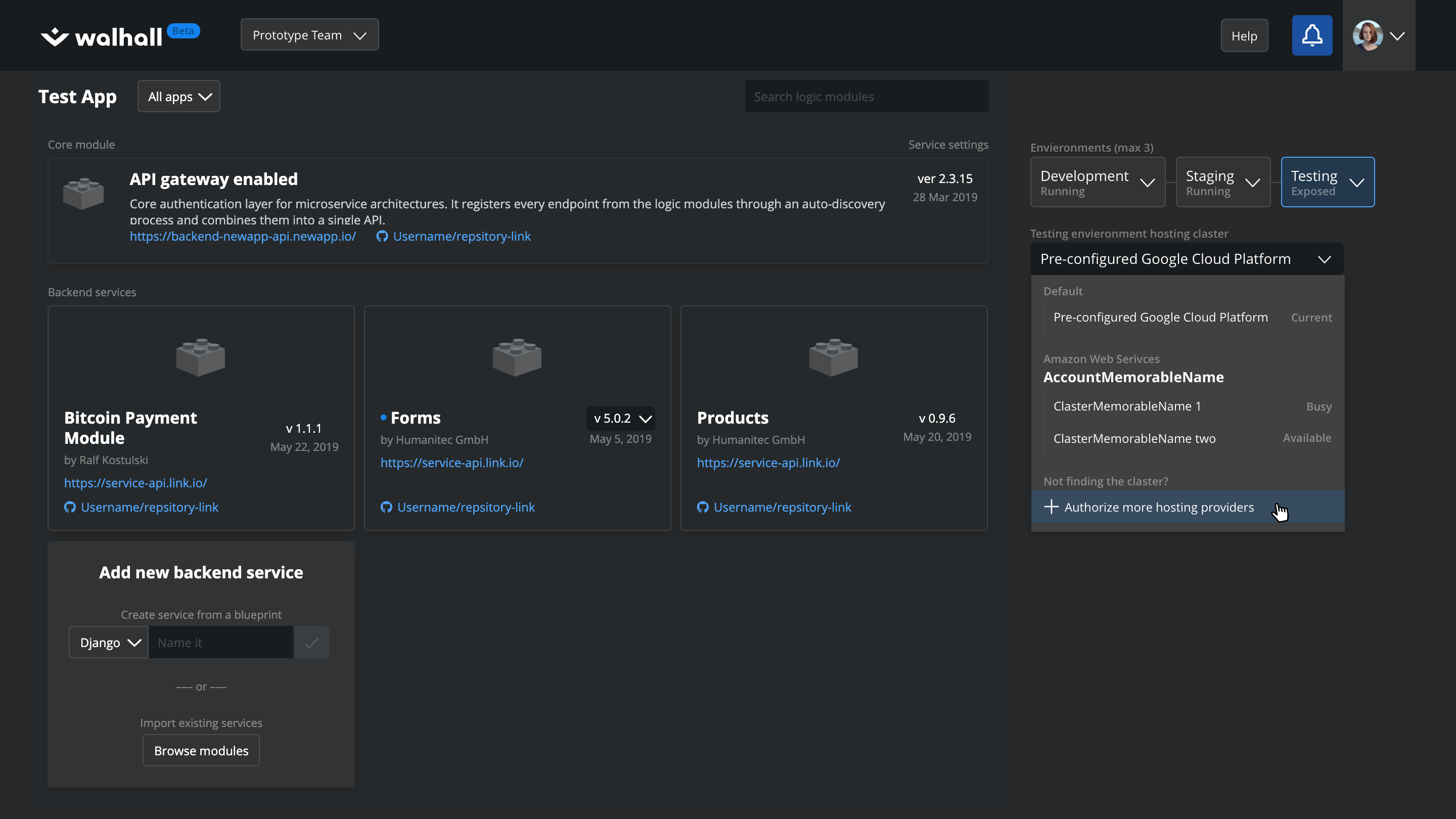
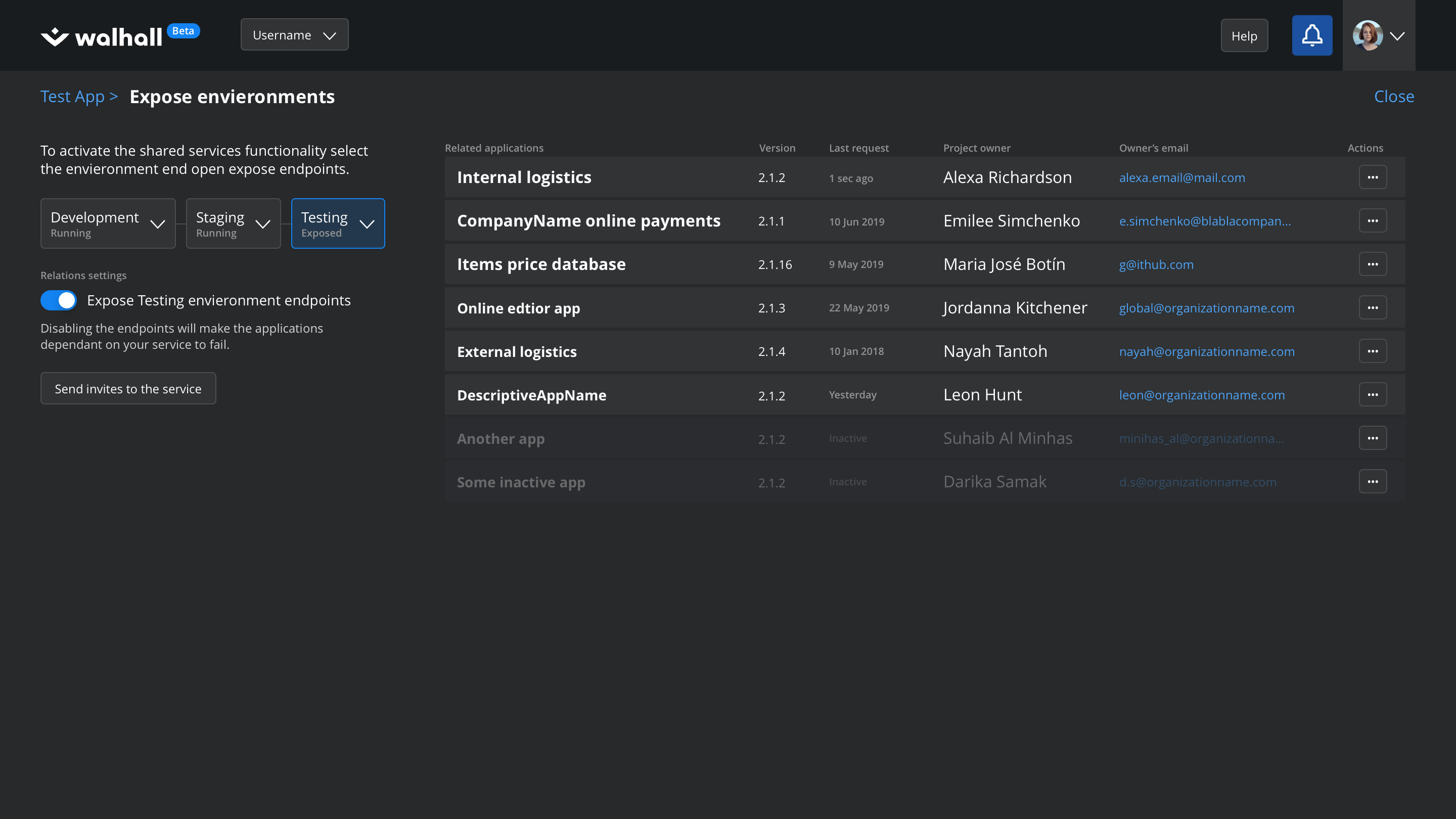
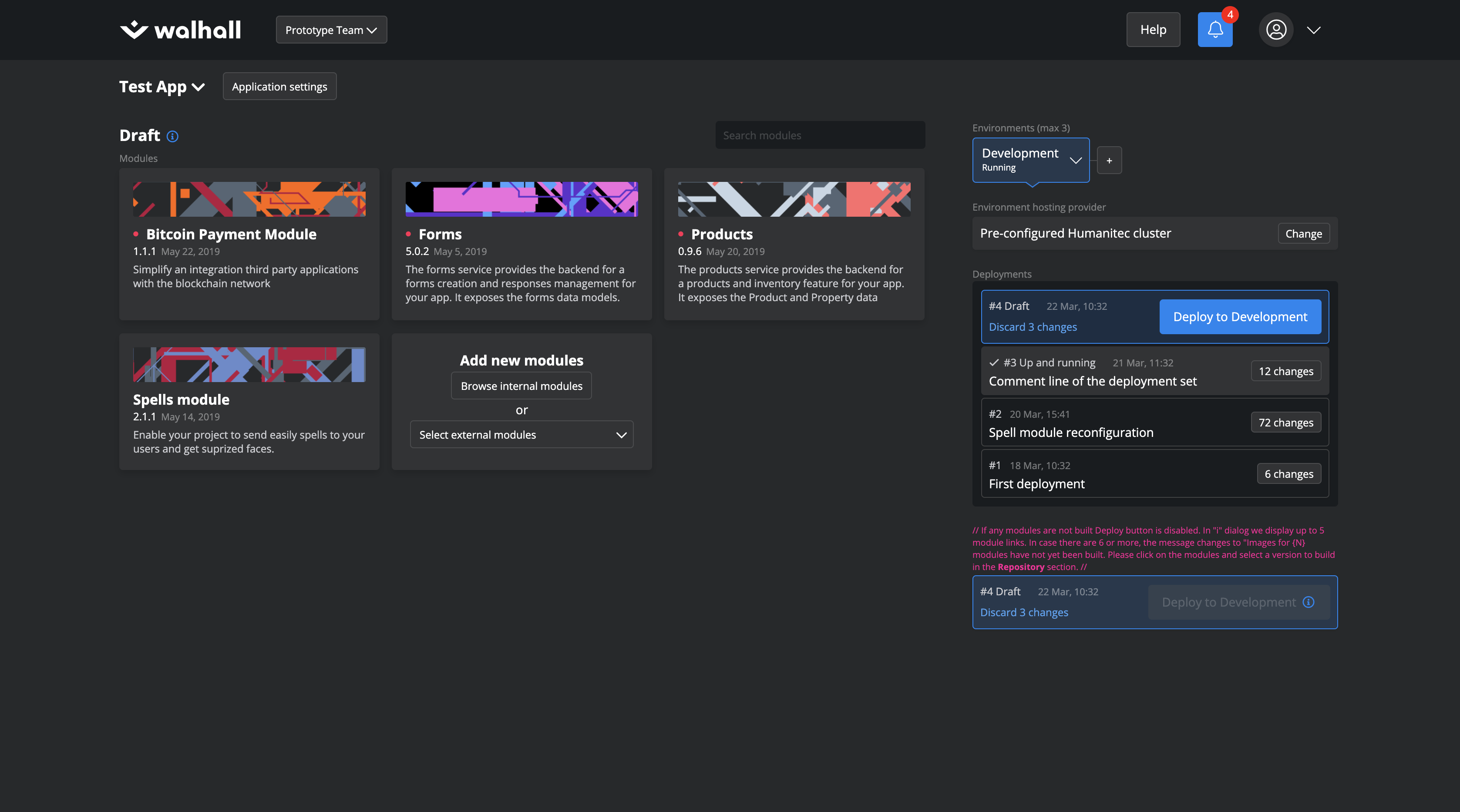
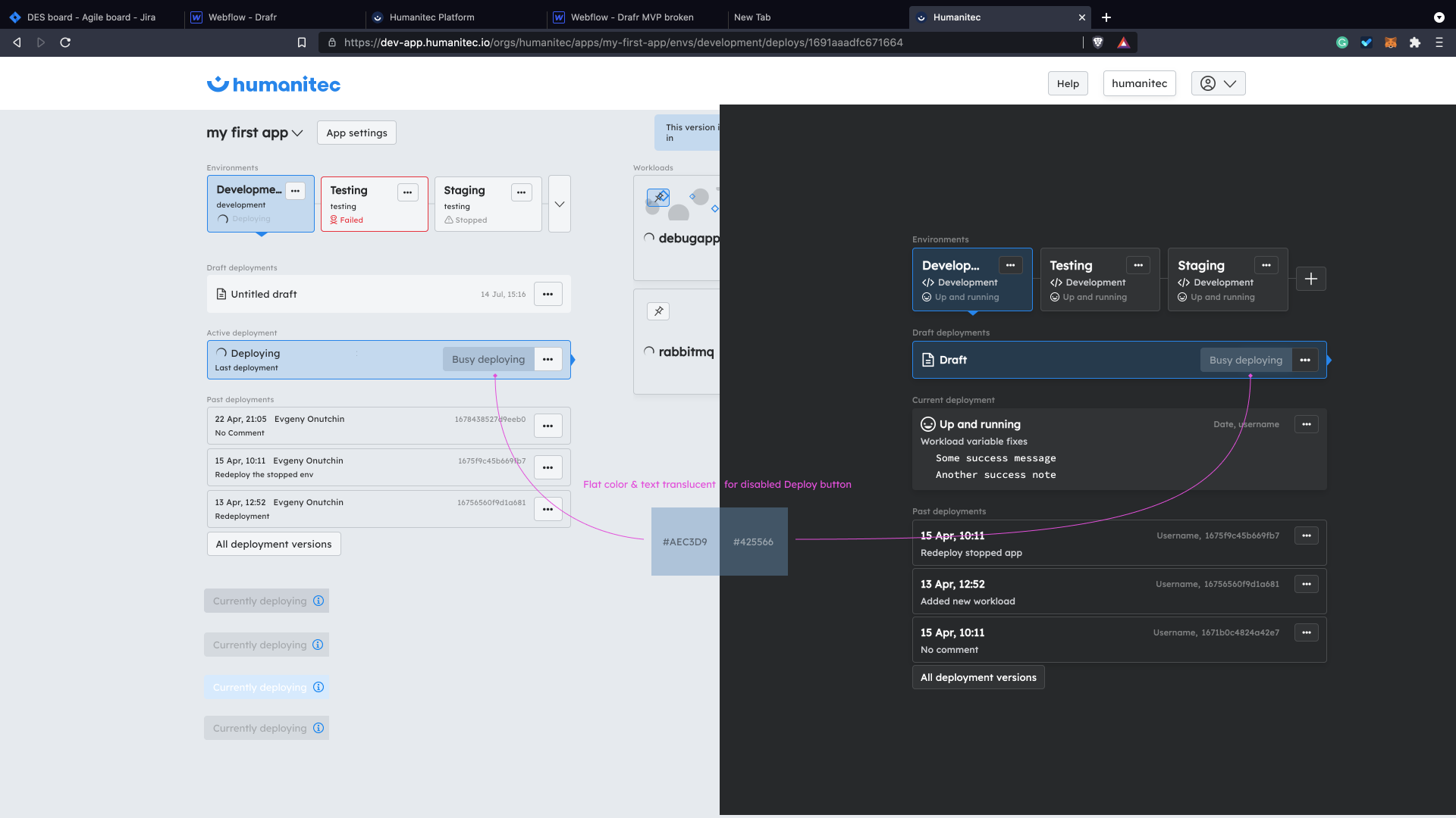
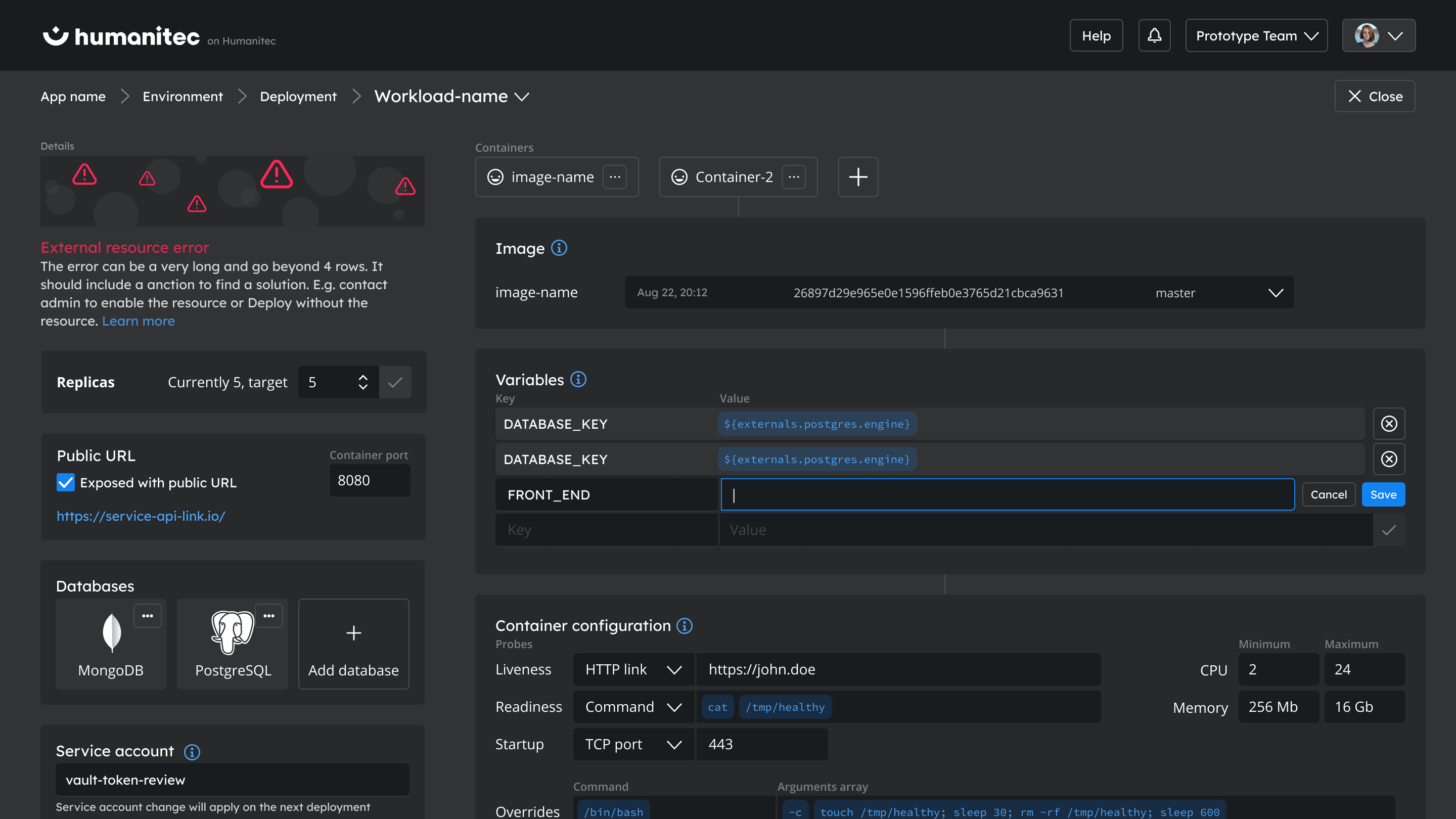
In designing the dark theme, we carefully considered various positions for the environment switchers. We experimented with layouts featuring the buttons in both the left and right columns, as demonstrated in the accompanying images.
This exercise allowed us to evaluate the impact of different placements on the overall user experience and to optimize the layout for maximum clarity and ease of use.
Simplicity over complexity
During the design process, we explored the idea of assigning unique graphical patterns to different workflows as a means of differentiation. However, upon reviewing the final result, we found that these patterns were drawing too much attention, potentially distracting users from their primary tasks.
Consequently, we decided to discard this option in favor of a more balanced and less distracting design approach.
Check out the prototype
Color scheme & elements design
Crafting a comfortable developer experience
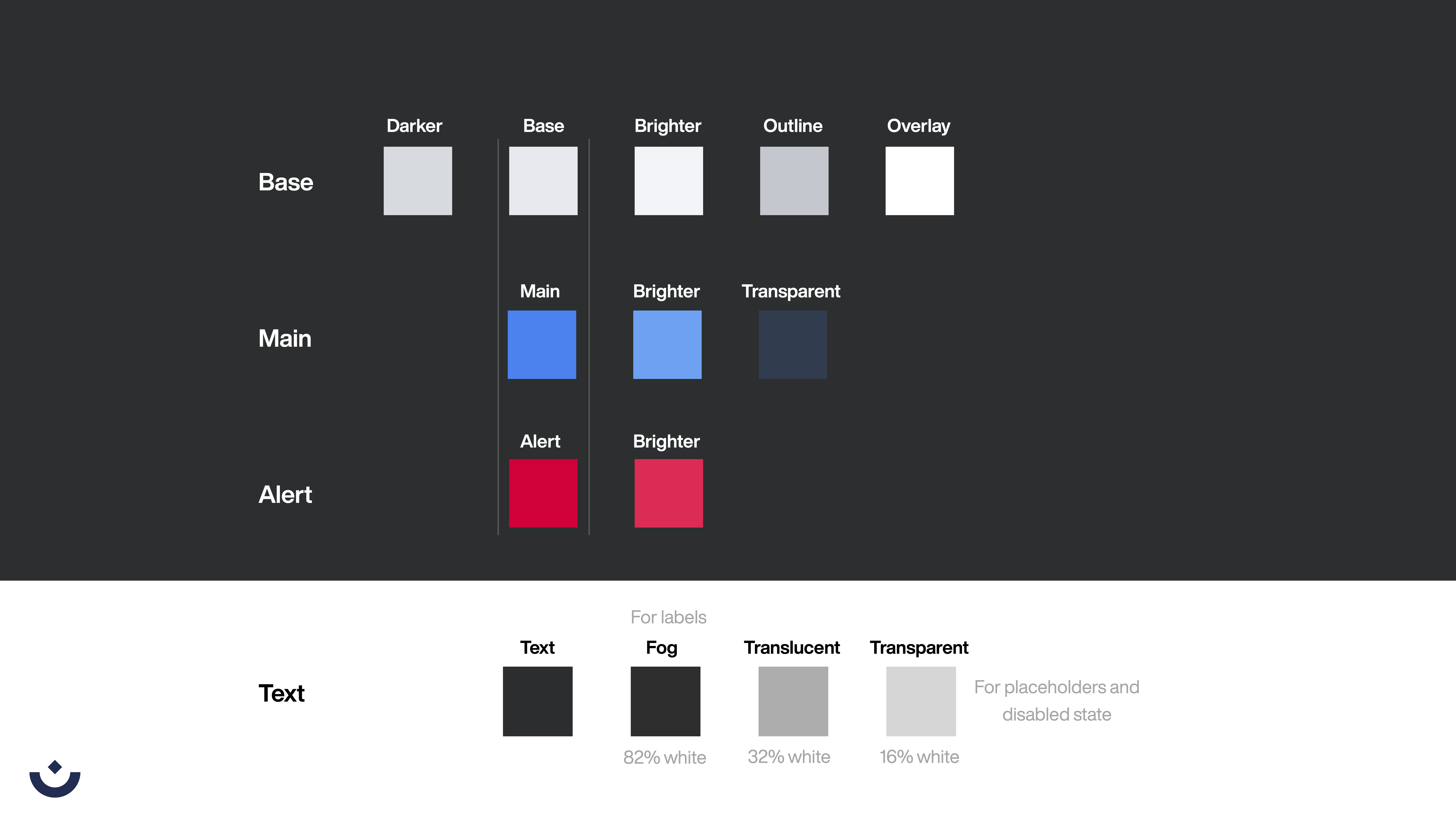
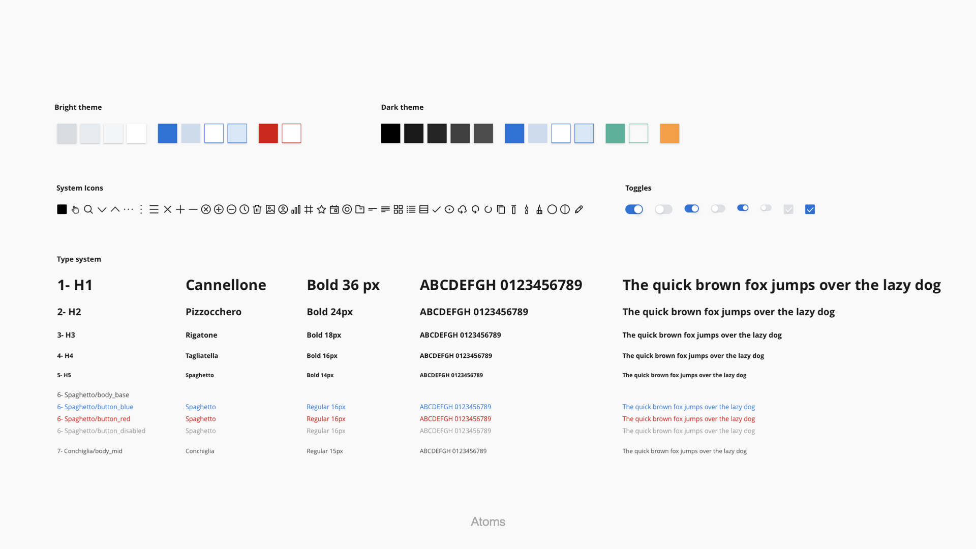
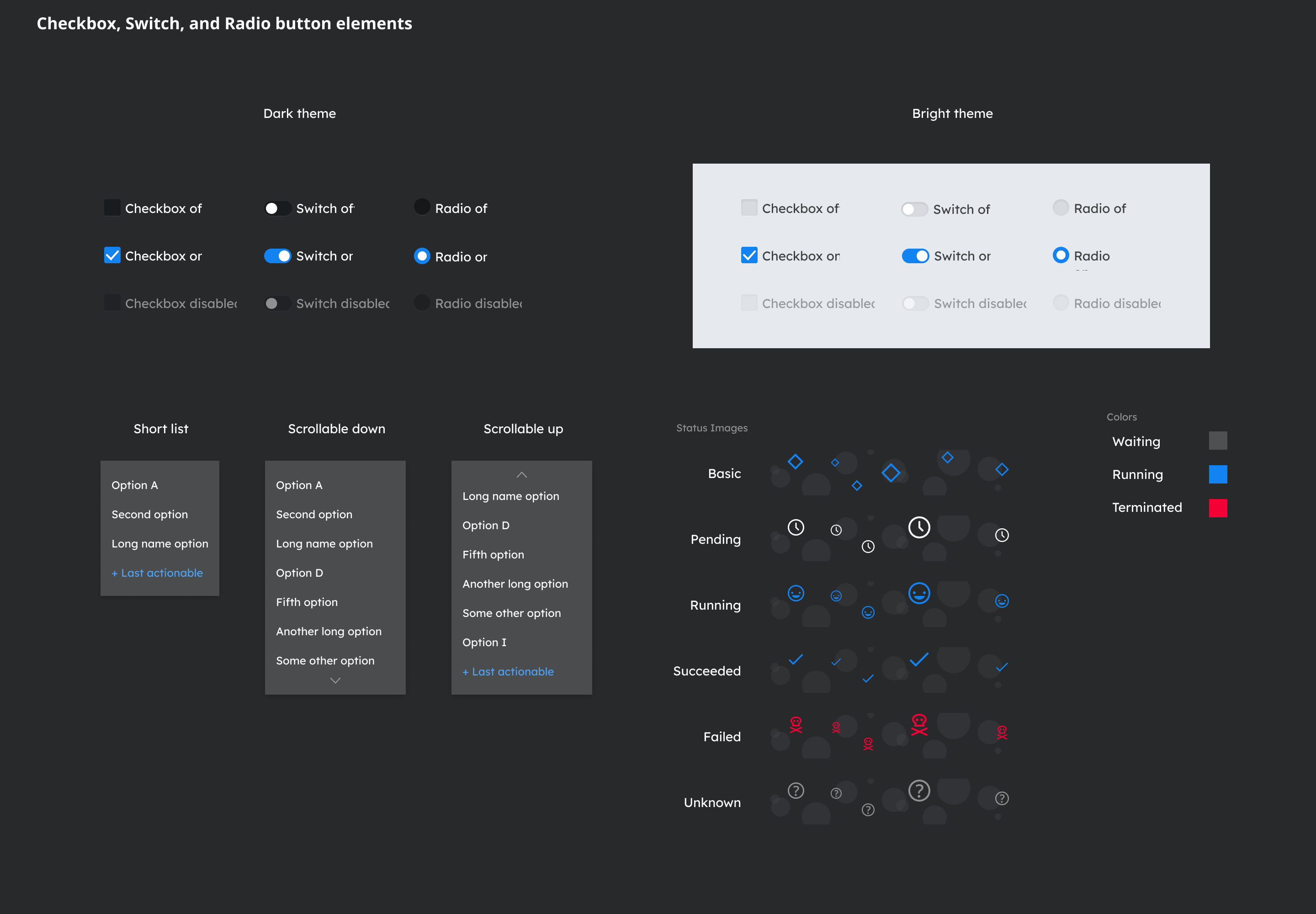
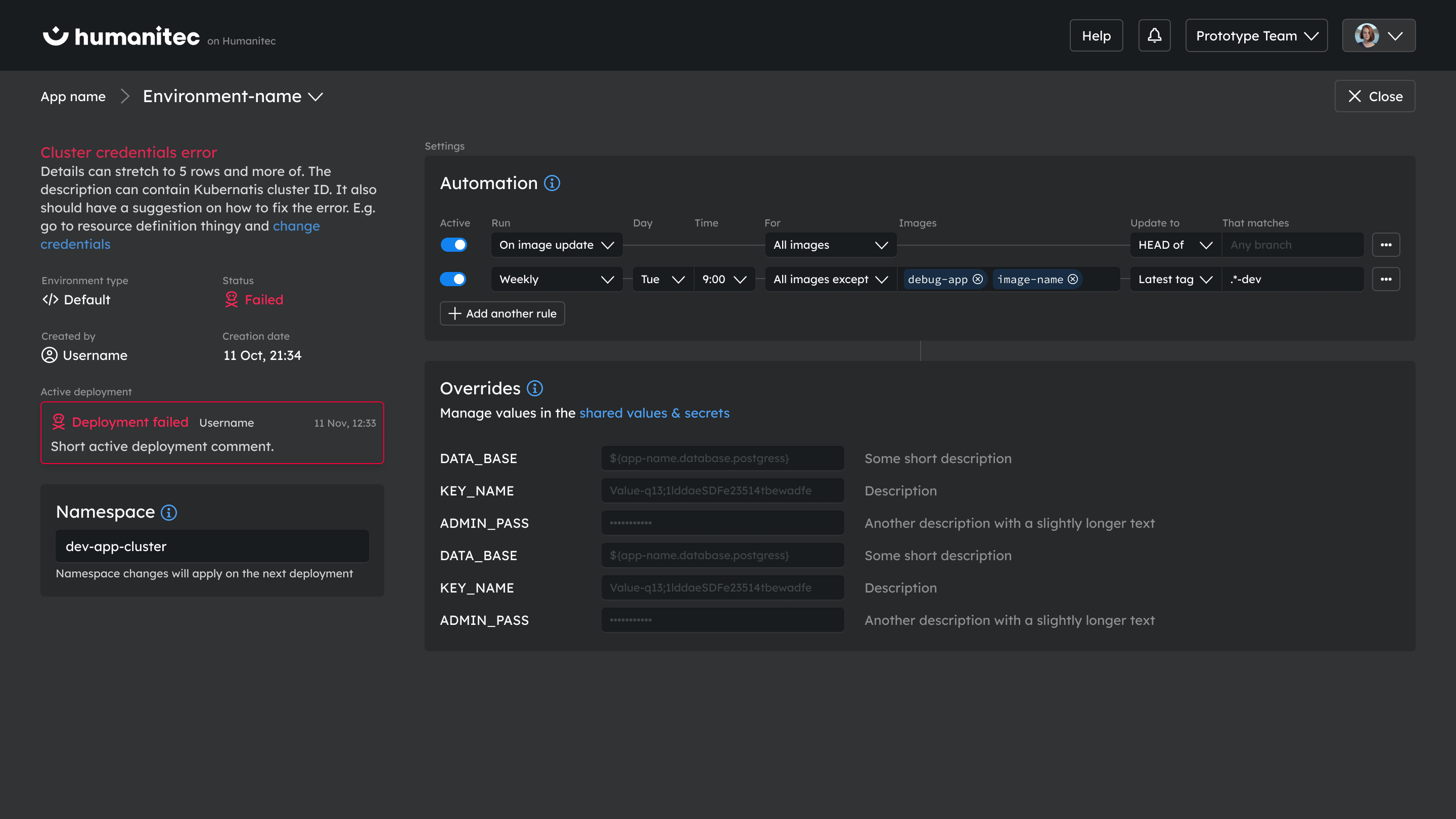
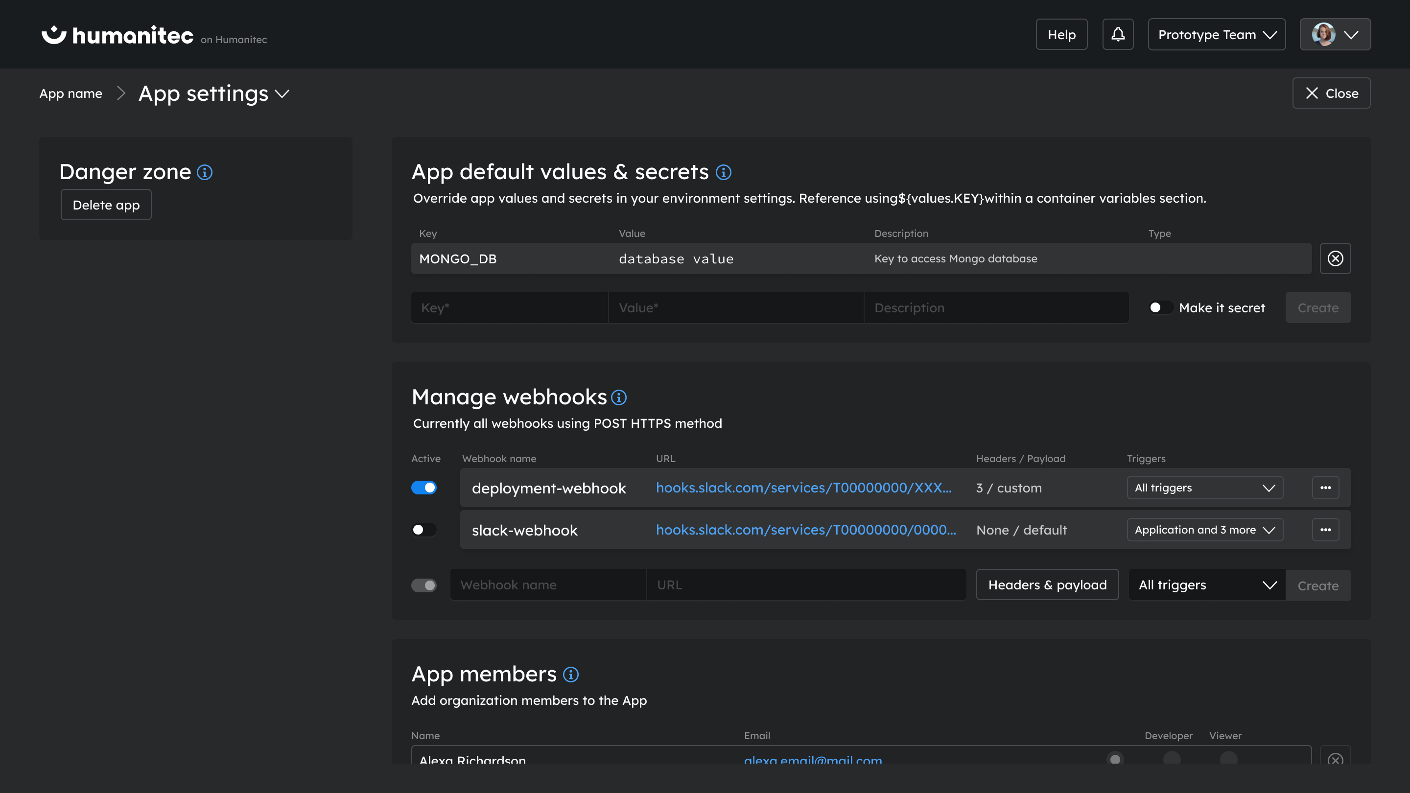
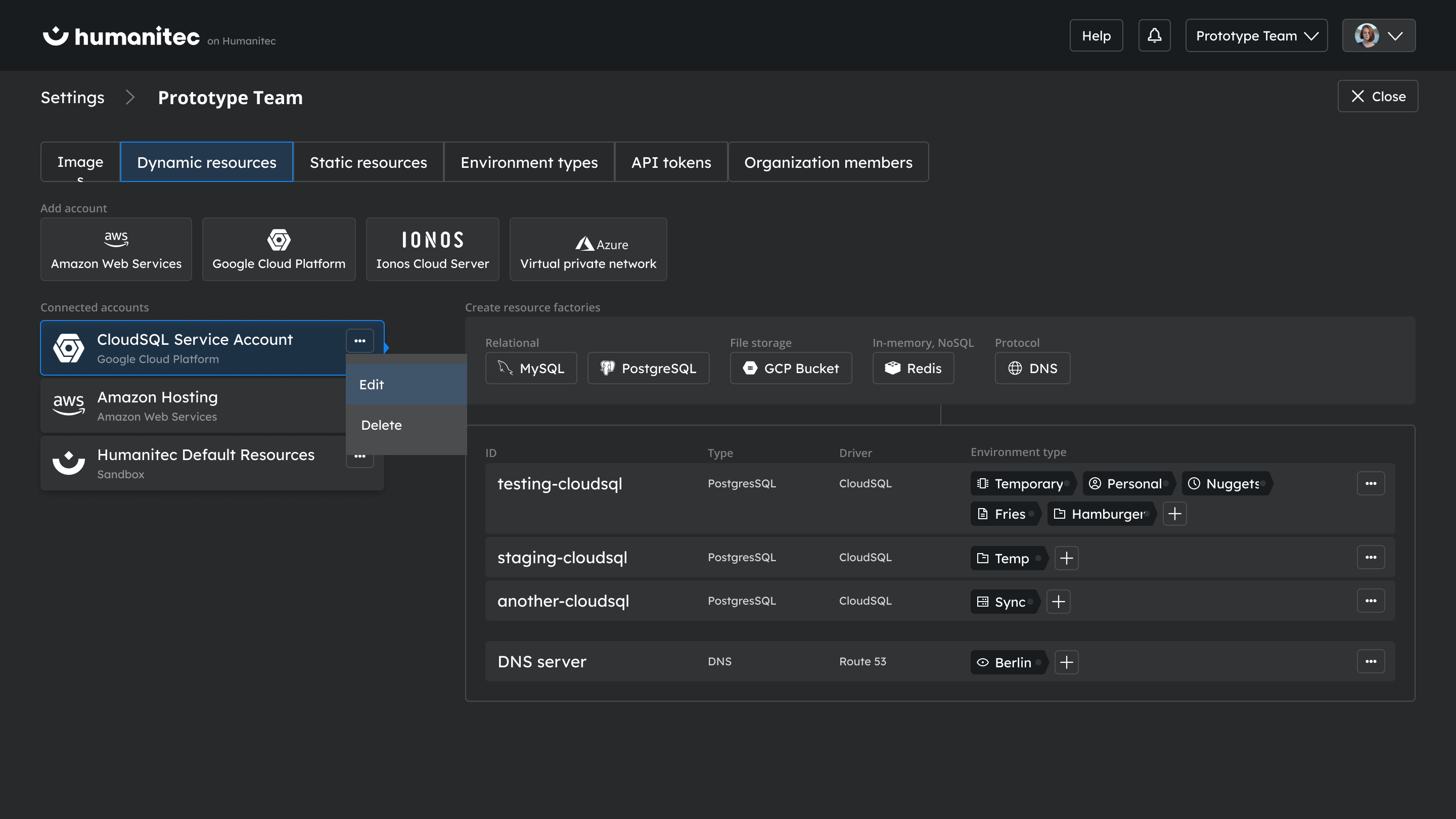
Colors play a crucial role in creating an engaging and user-friendly interface. Recognizing this, we've carefully curated color schemes that cater to different lighting conditions and personal preferences.
By offering both dark and bright options, we created an adaptable and personalized user experience, ensuring the platform remains accessible, intuitive, and visually pleasing under any lighting condition.
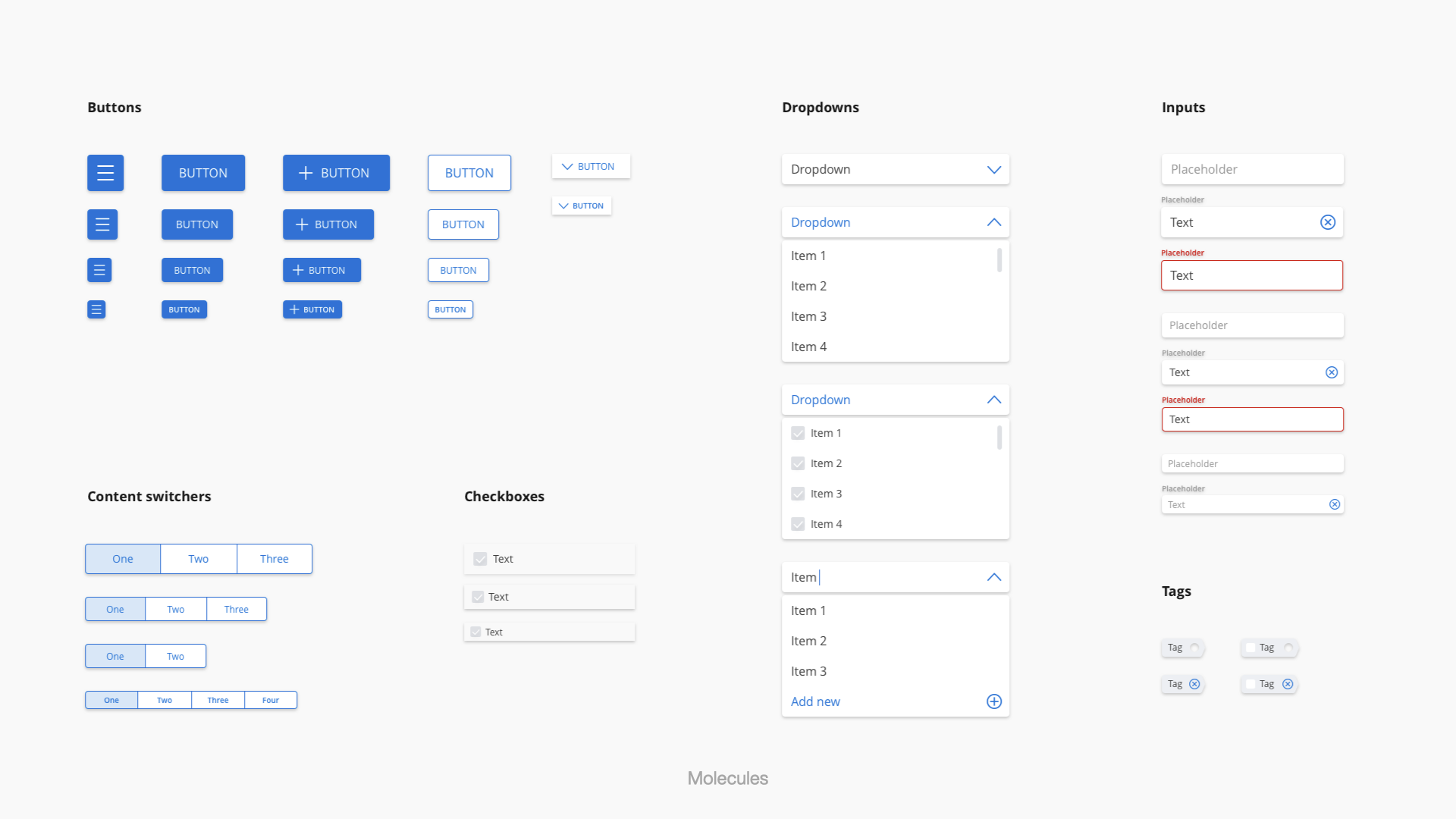
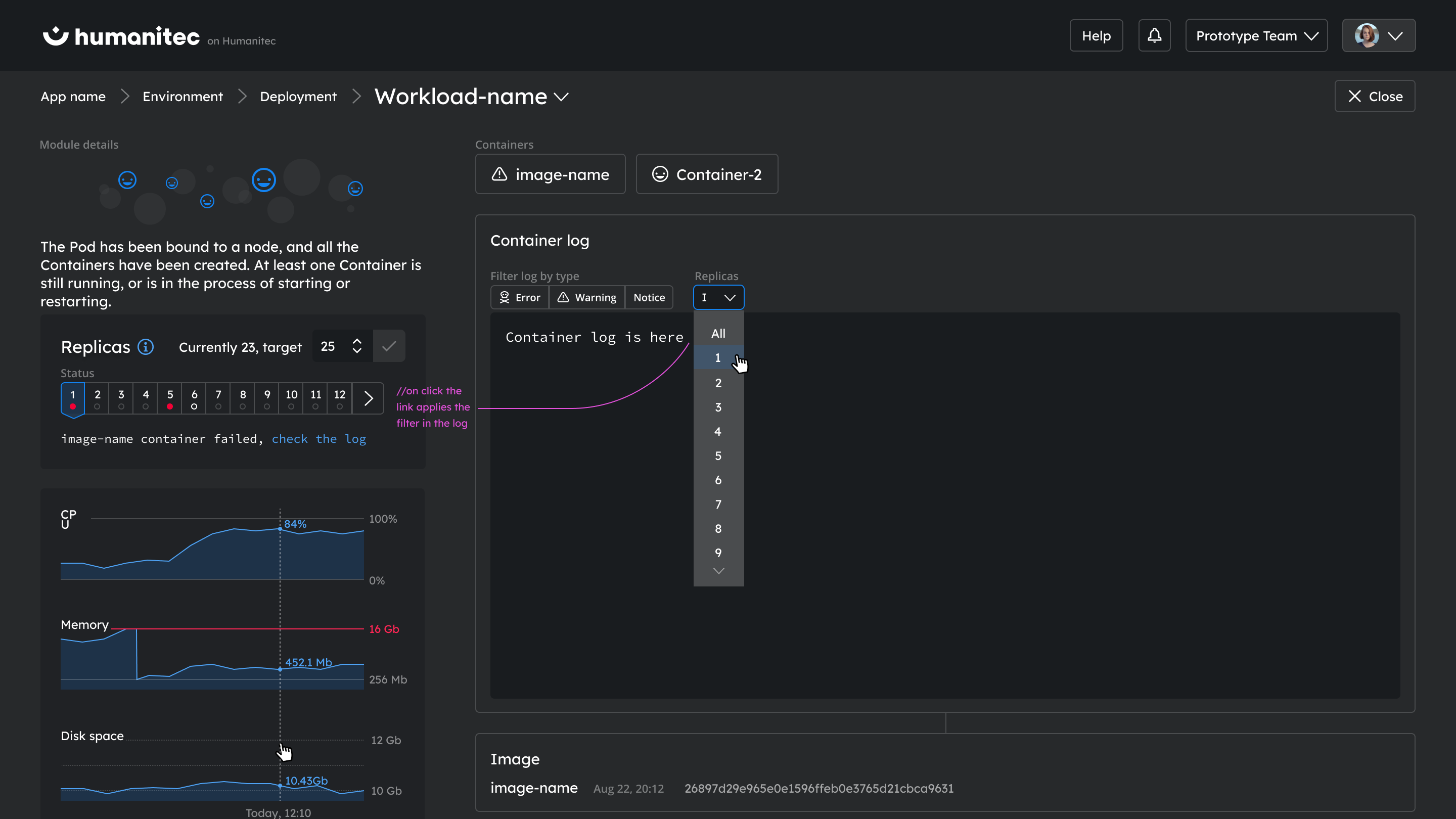
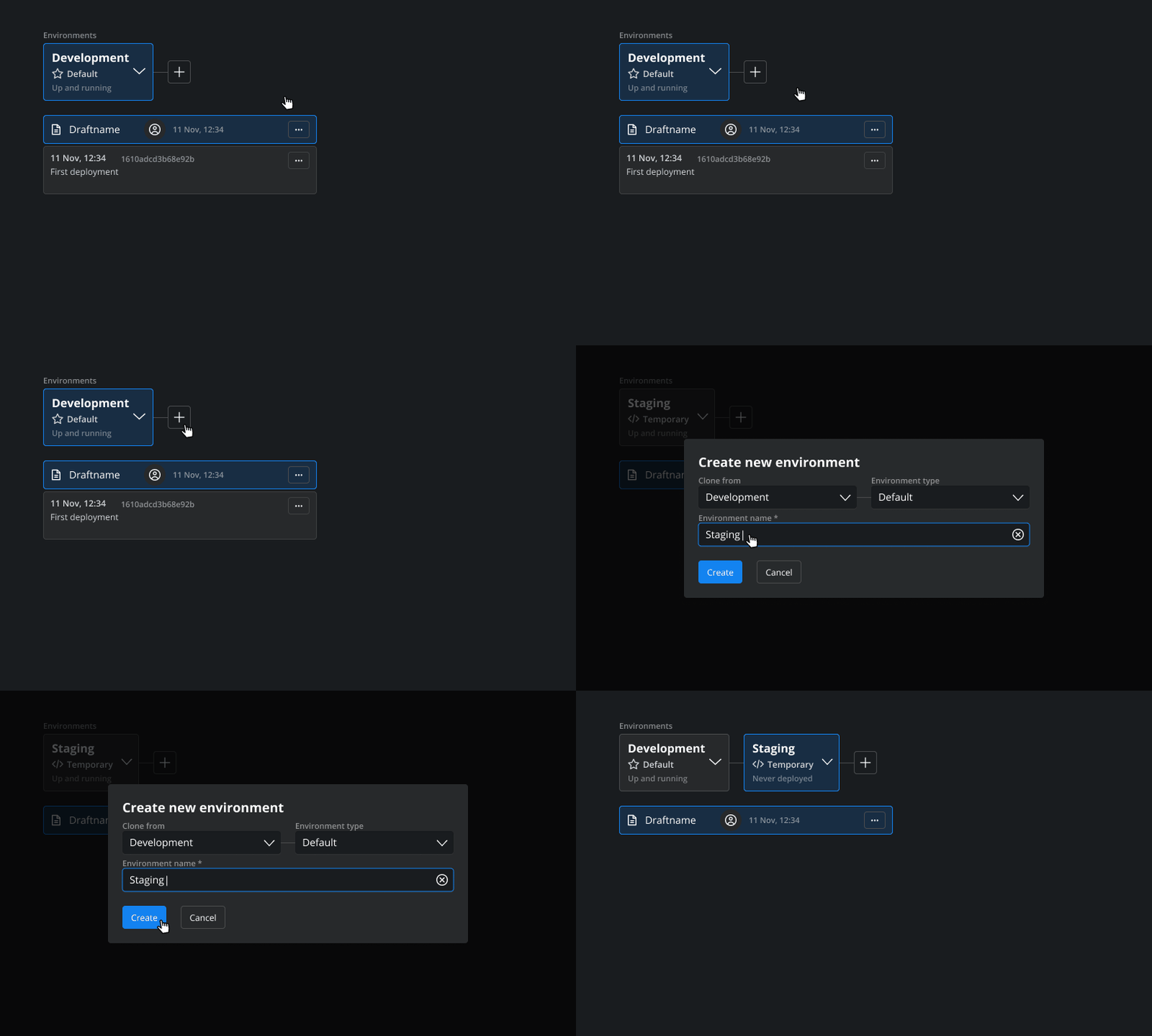
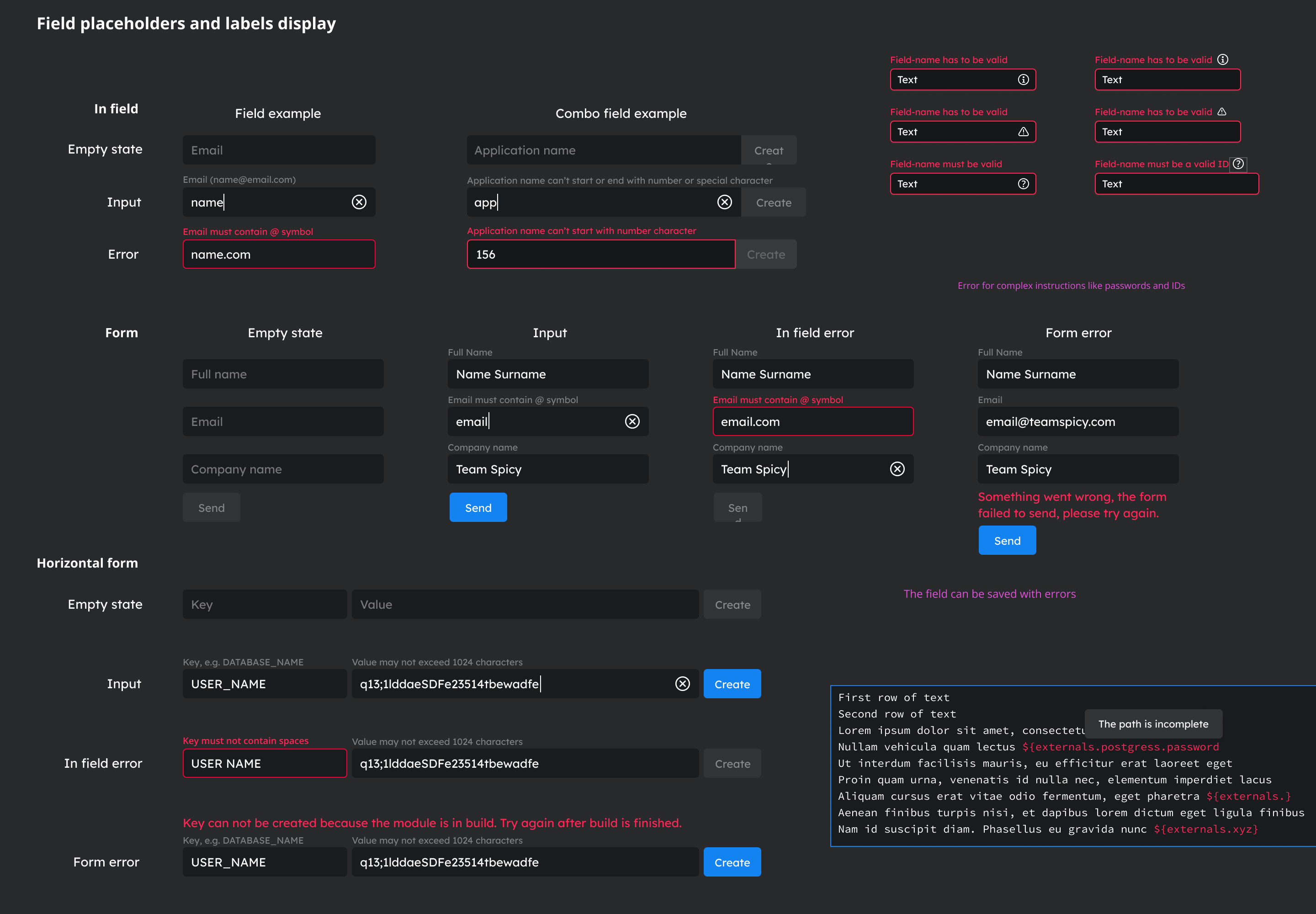
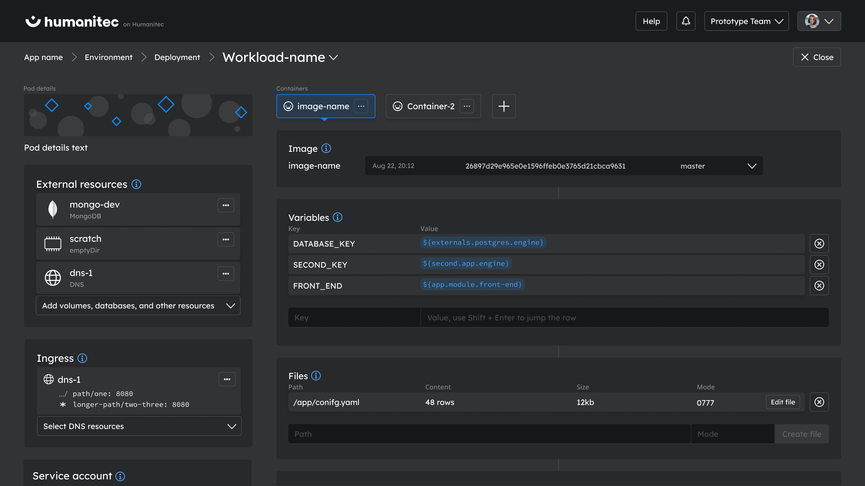
Our design optimizes user interactions with trigger elements, eliminating the need for users to synchronize between screens, thereby ensuring a seamless and intuitive user experience.
User Testing
Our user testing strategy for the Humanitec project was spearheaded by a dedicated user researcher with a background in anthropology. This allowed us to gather deep, insightful feedback and develop a robust ecosystem of design.
Weekly design meetings were centered around the review of user testing sessions, which greatly influenced our UX design tasks and UI improvement plans.
UX researcher conducted the tests on both interactive prototypes developed in Webflow and the actual web app. This comprehensive testing approach ensured that our designs were not only visually compelling but also centered around real user needs and experiences.
Humanitec GmbH
